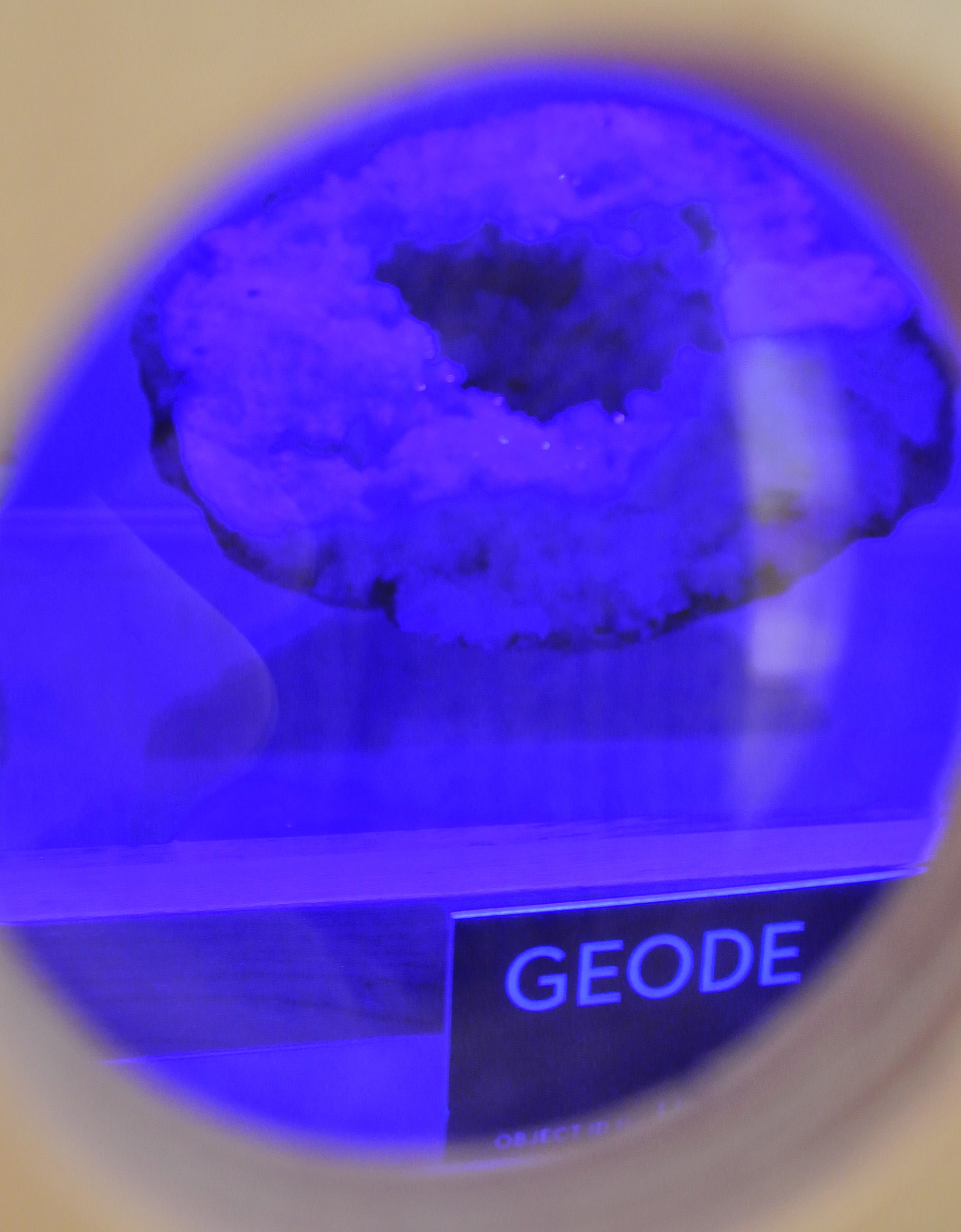
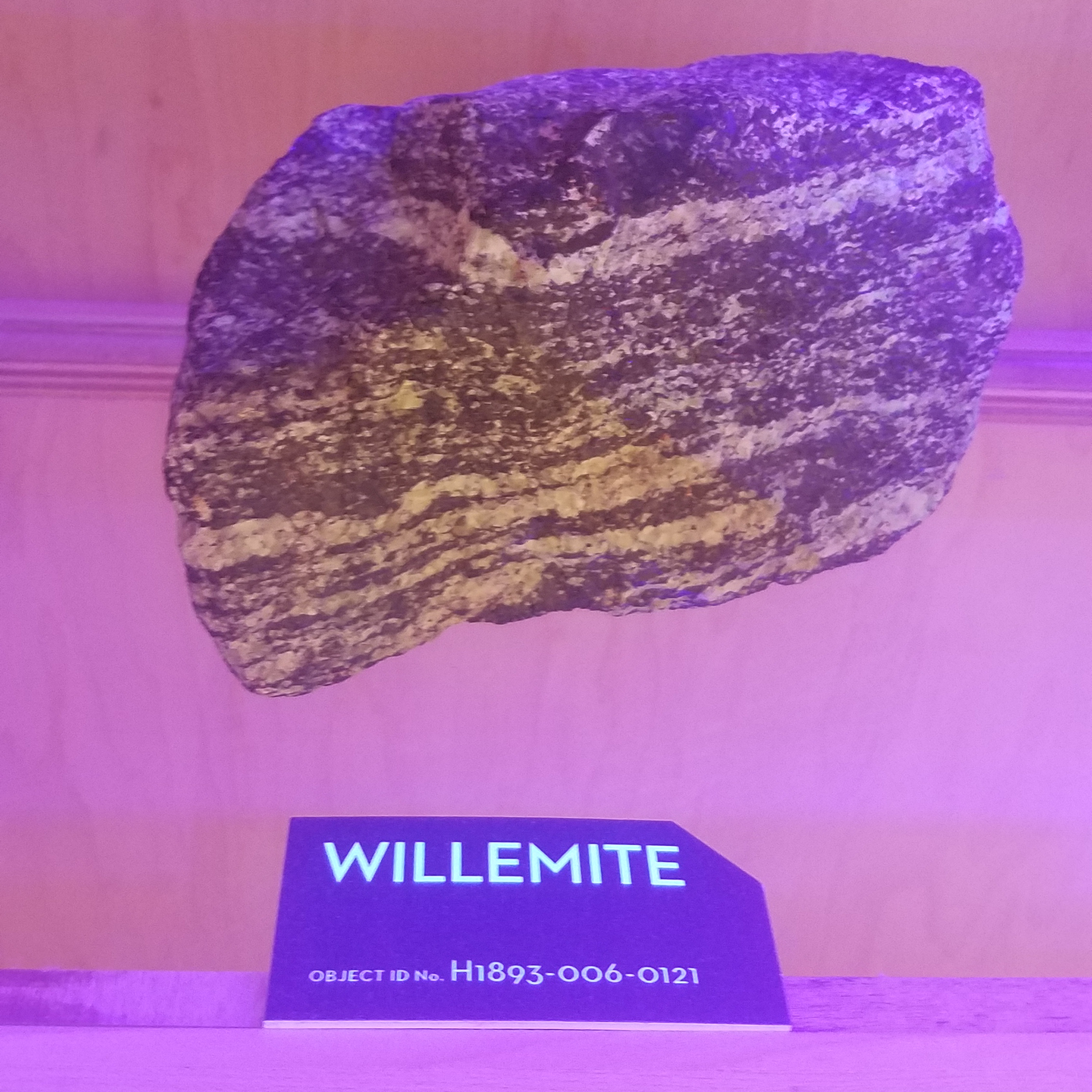
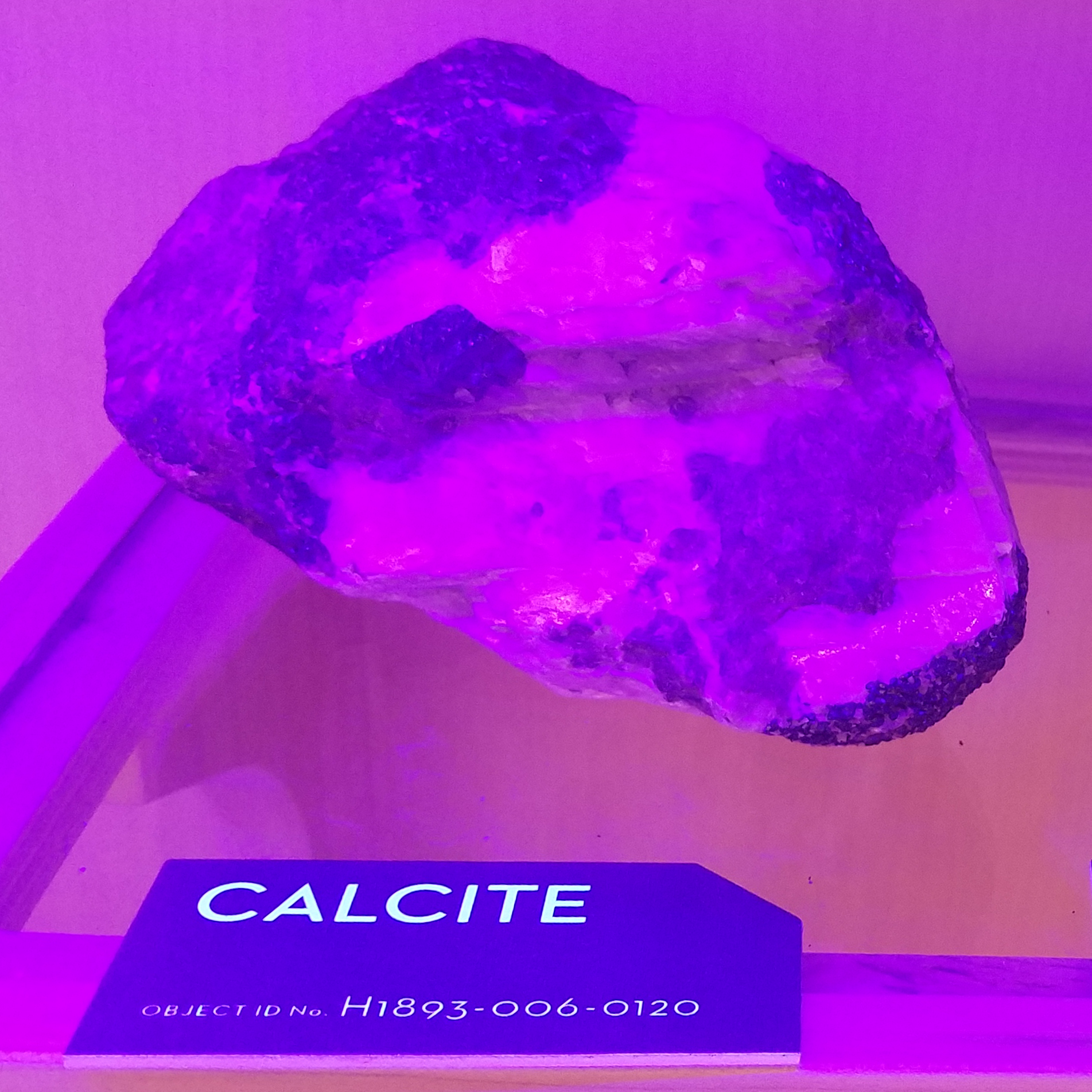
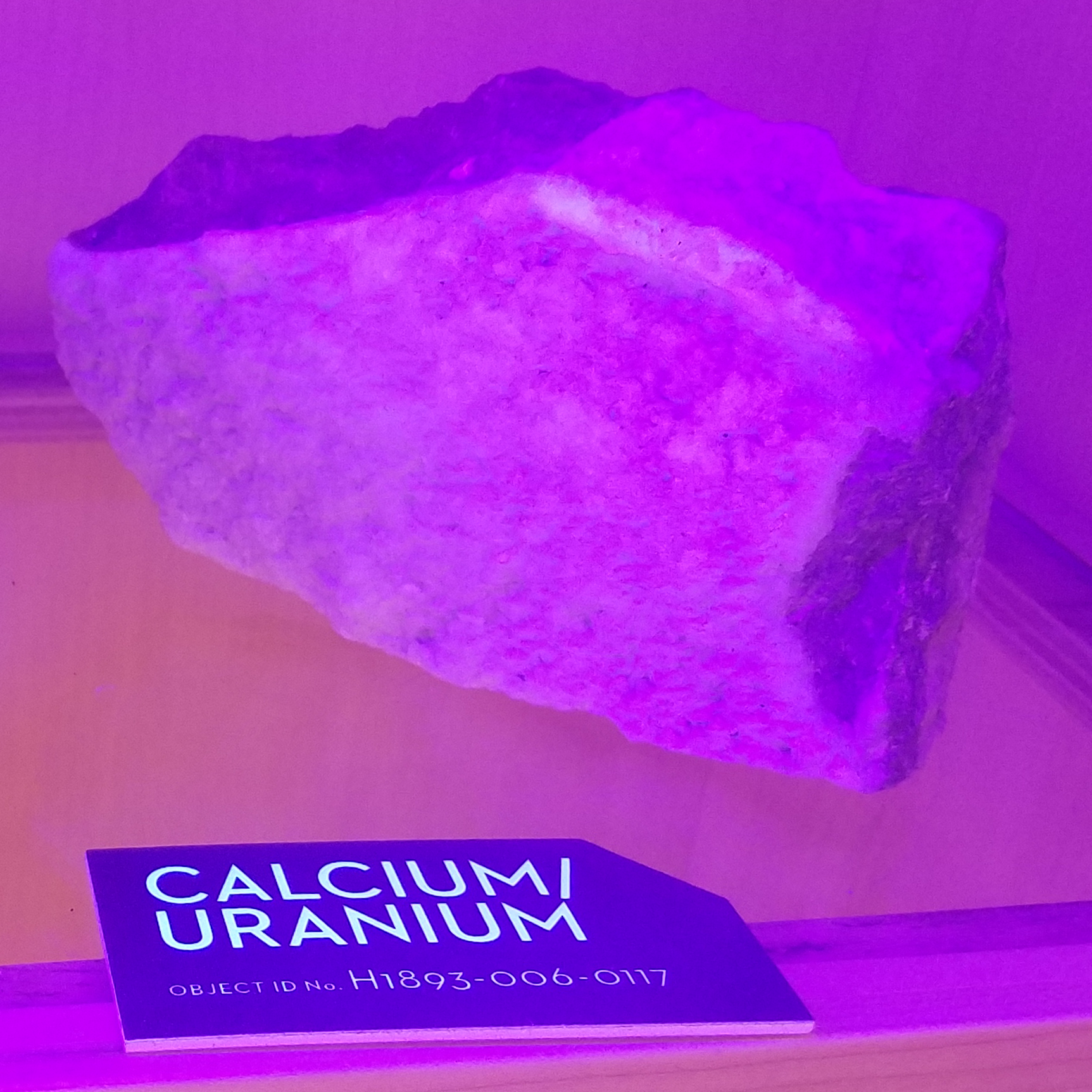
BLACK LIGHT GLOW LABELS
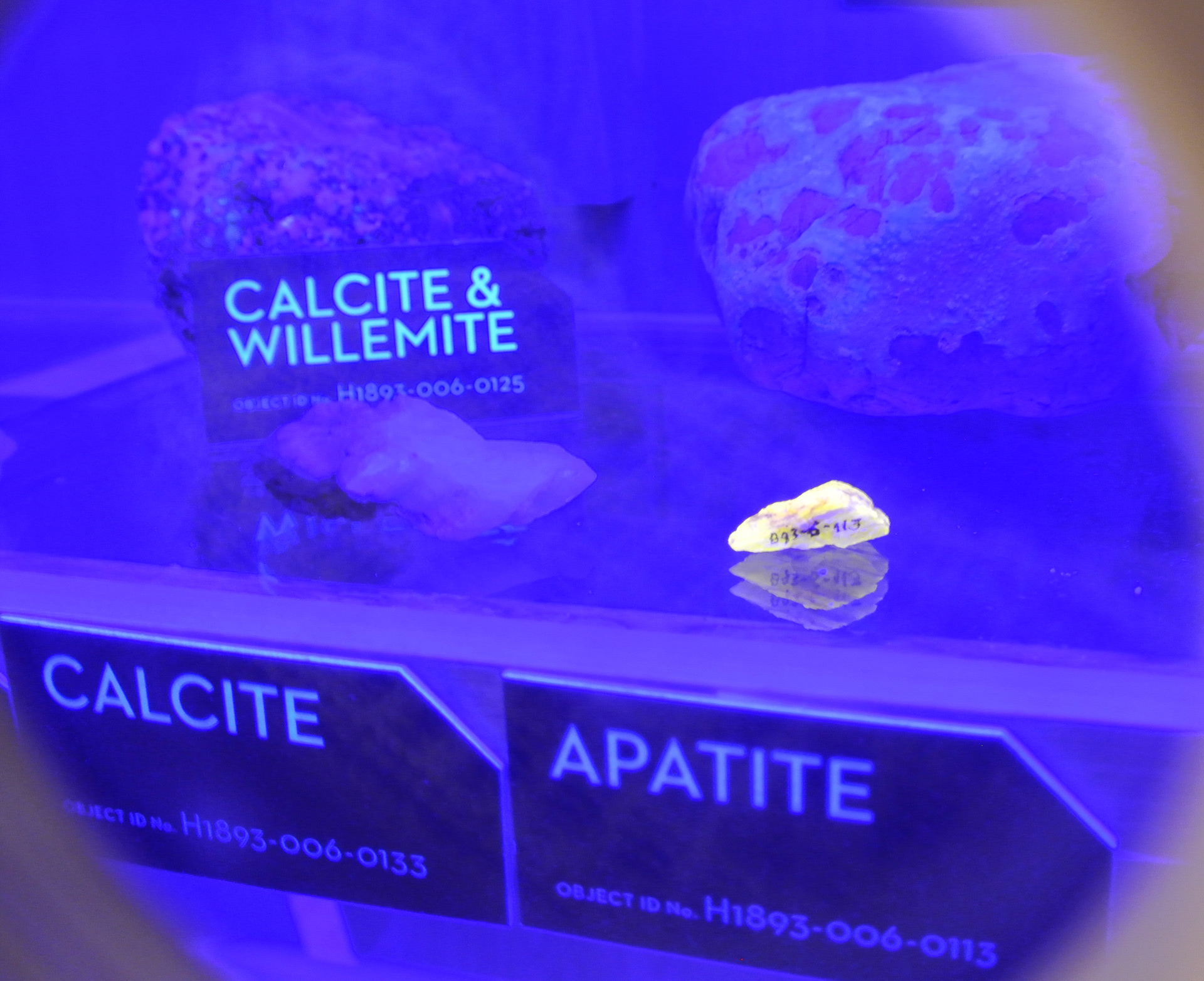
The bioluminescence of rocks can be demonstrated using a UV black light. I created UV reactive labels for this museum exhibit that could still be read when placed inside the dark display cubbies. I developed a process combining laser cut materials and UV printing methods to create these custom labels that fit cohesively with the museum's visual identity.
BRAILLE PRINTER LABELS
Using raised indents and enhanced color printing, these printers were created as a tool for the visually impaired. I developed a range of tactile labels for the line using laser engraving and various UV printed elements to add contrast, definition, and texture to assist in low visibility button navigation. The labels had to fit around obstacles like buttons and sit inside predetermined channels while still being accessible and easy to navigate by touch.
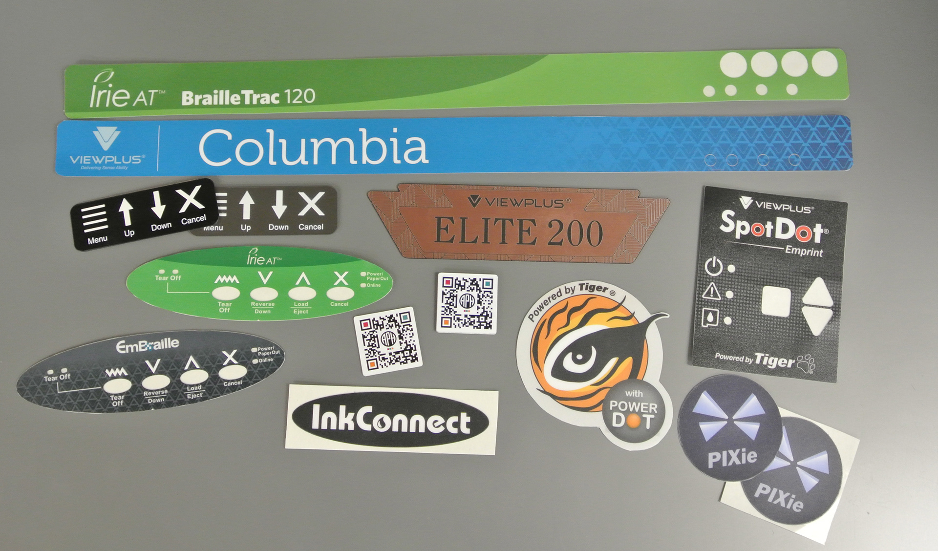
Engraved acrylic, digitally printed, and UV printed labels I designed for a braille printer manufacturer.
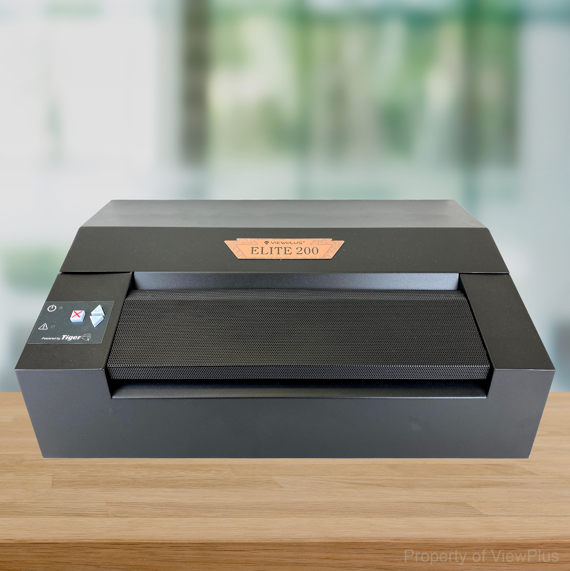
The Elite engraved label
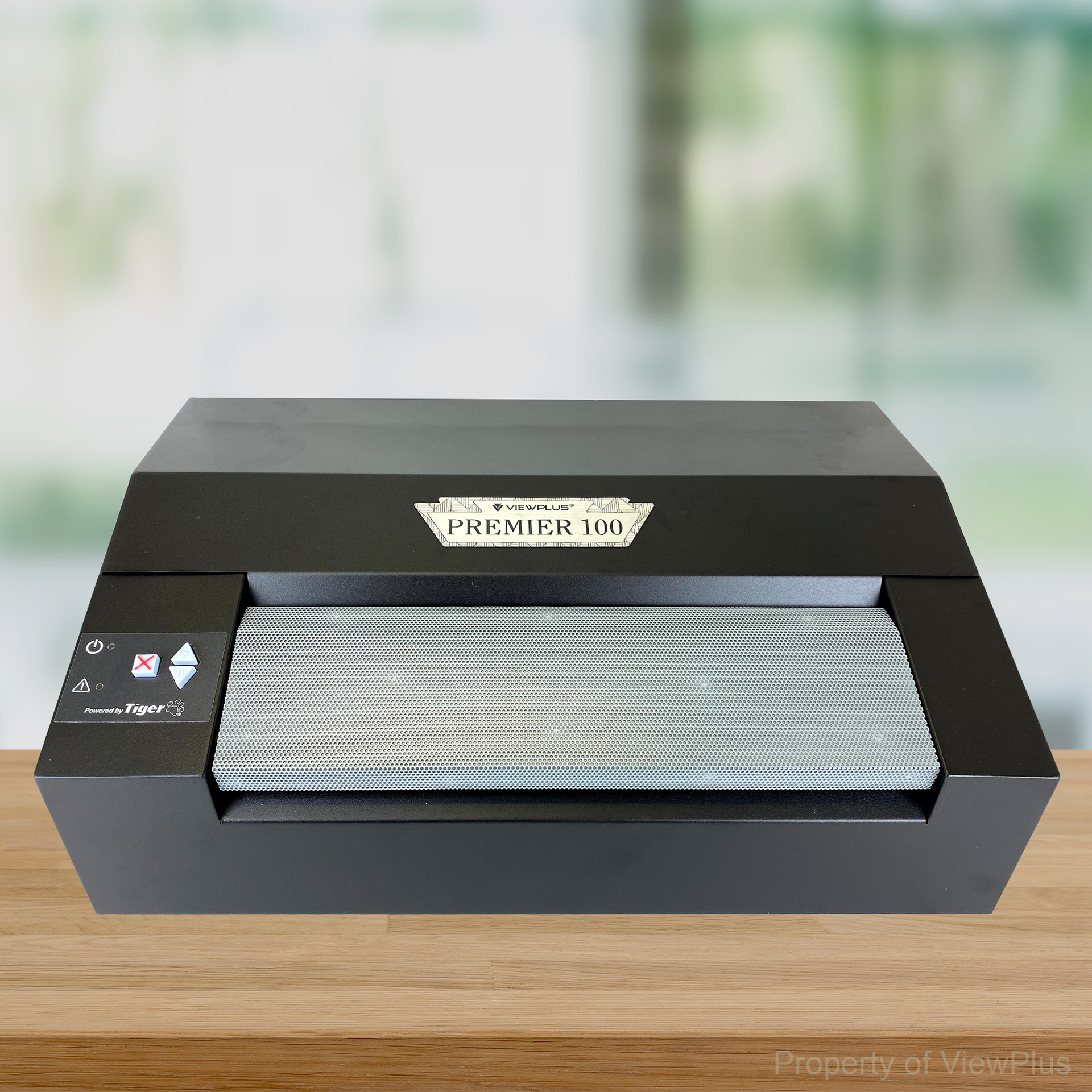
The Premier engraved label
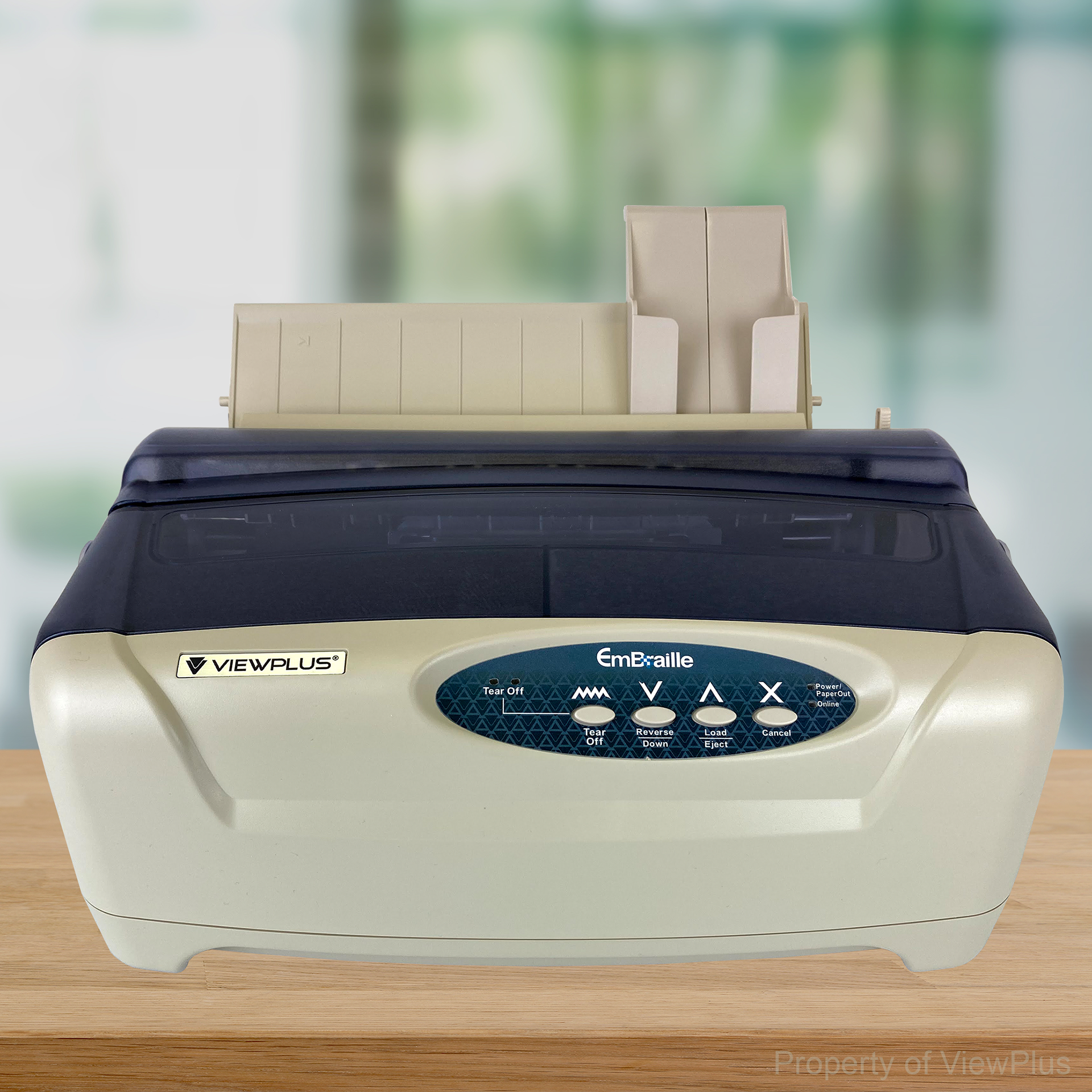
The EmBraille digital and UV printed label
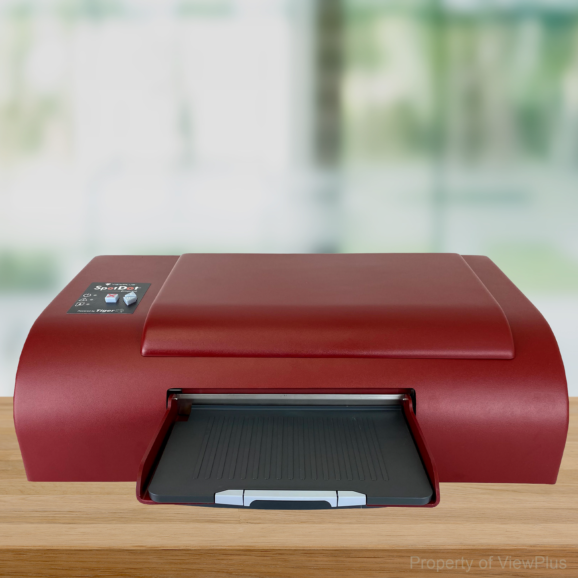
The SpotDot digital and UV printed label
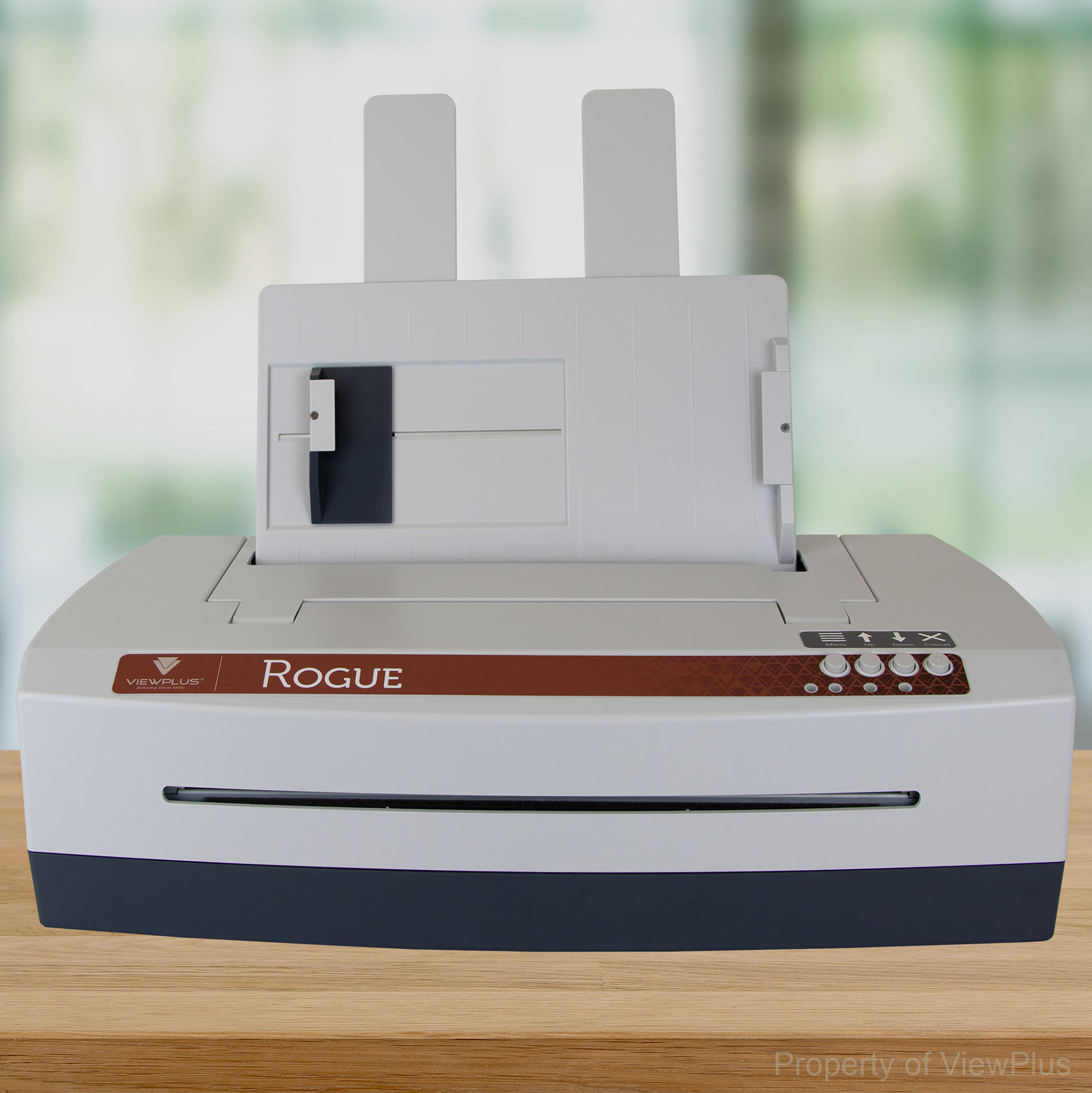
The Rogue printed label
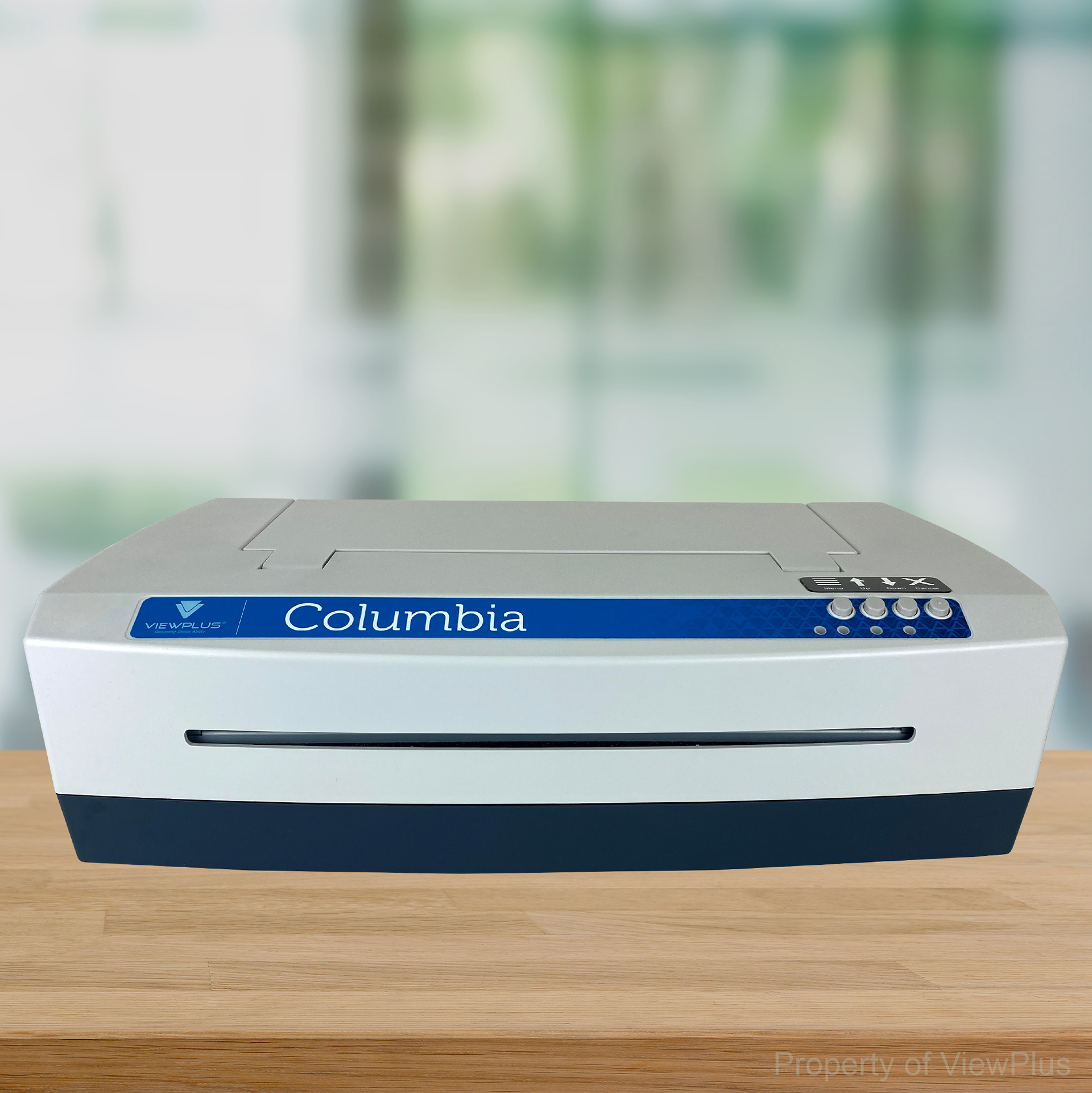
The Columbia printed label
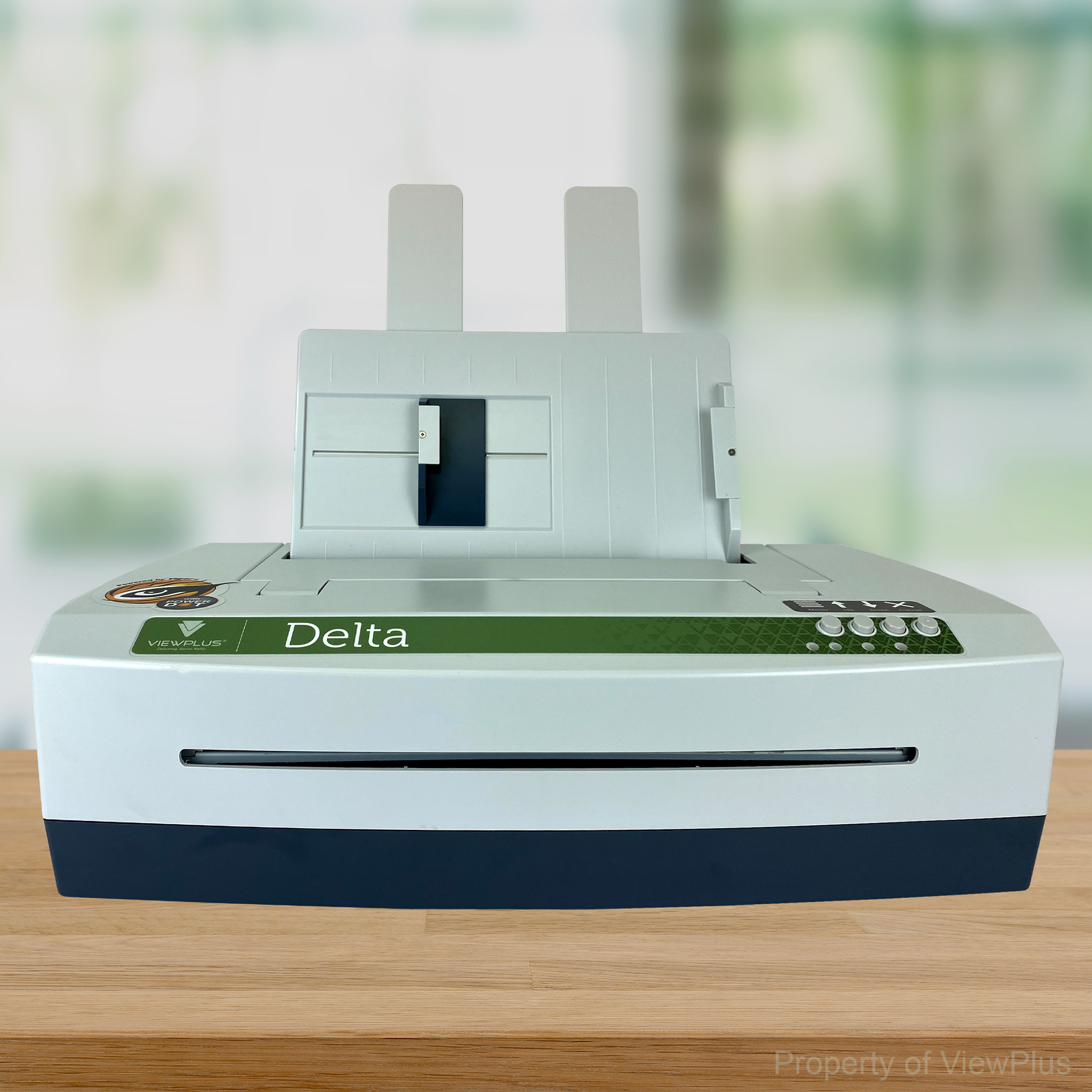
The Delta and Tiger SpotDot printed label
BOXES & STICKER LABELS
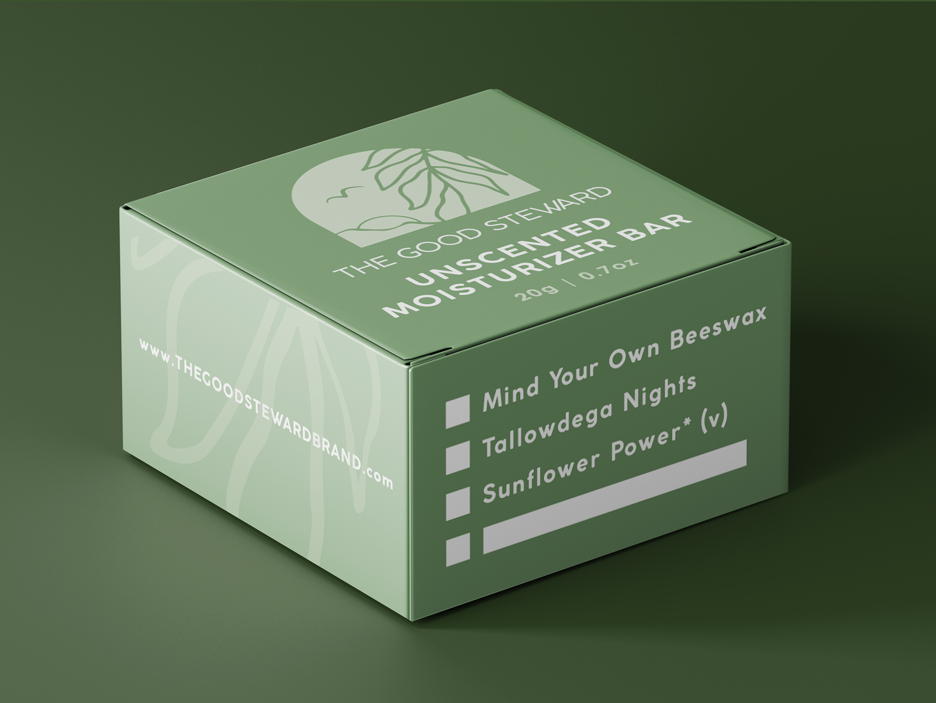
I designed this minimal box using calming colors, a clear modern font, and versatile function for multiple products.
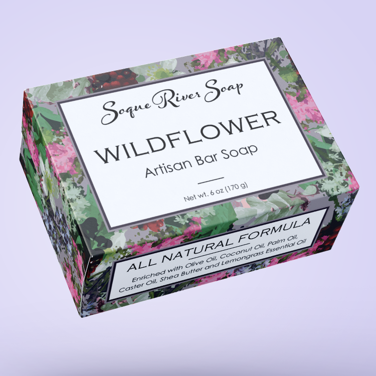
The aesthetic for this soap line needed to clearly differentiate each scent while still grouping the line with a cohesive and classic look.
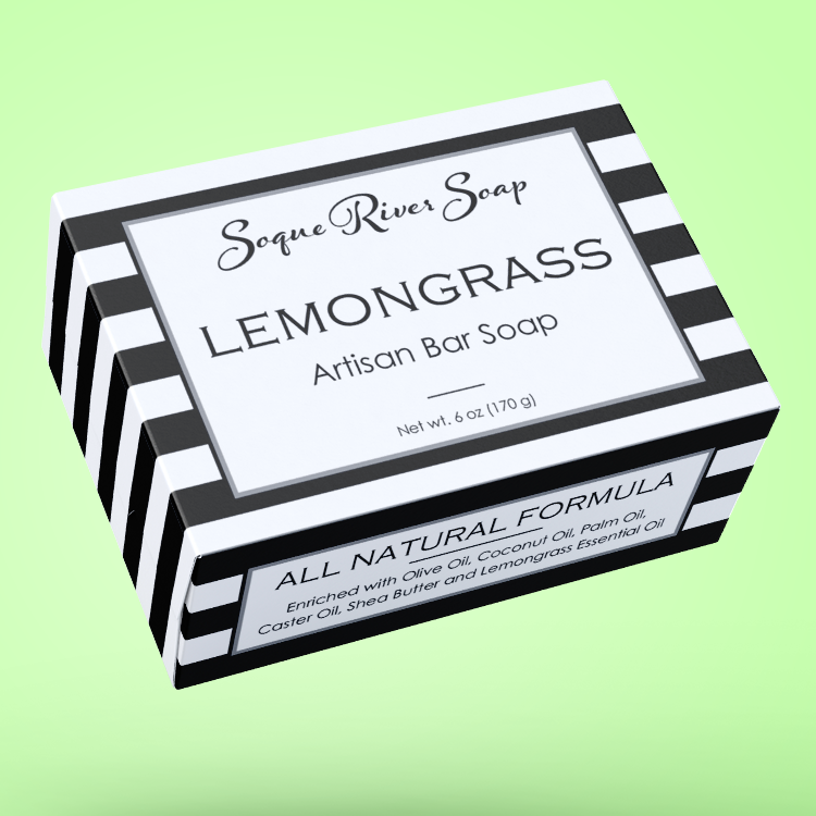
The aesthetic for this soap line needed to clearly differentiate each scent while still grouping the line with a cohesive and classic look.
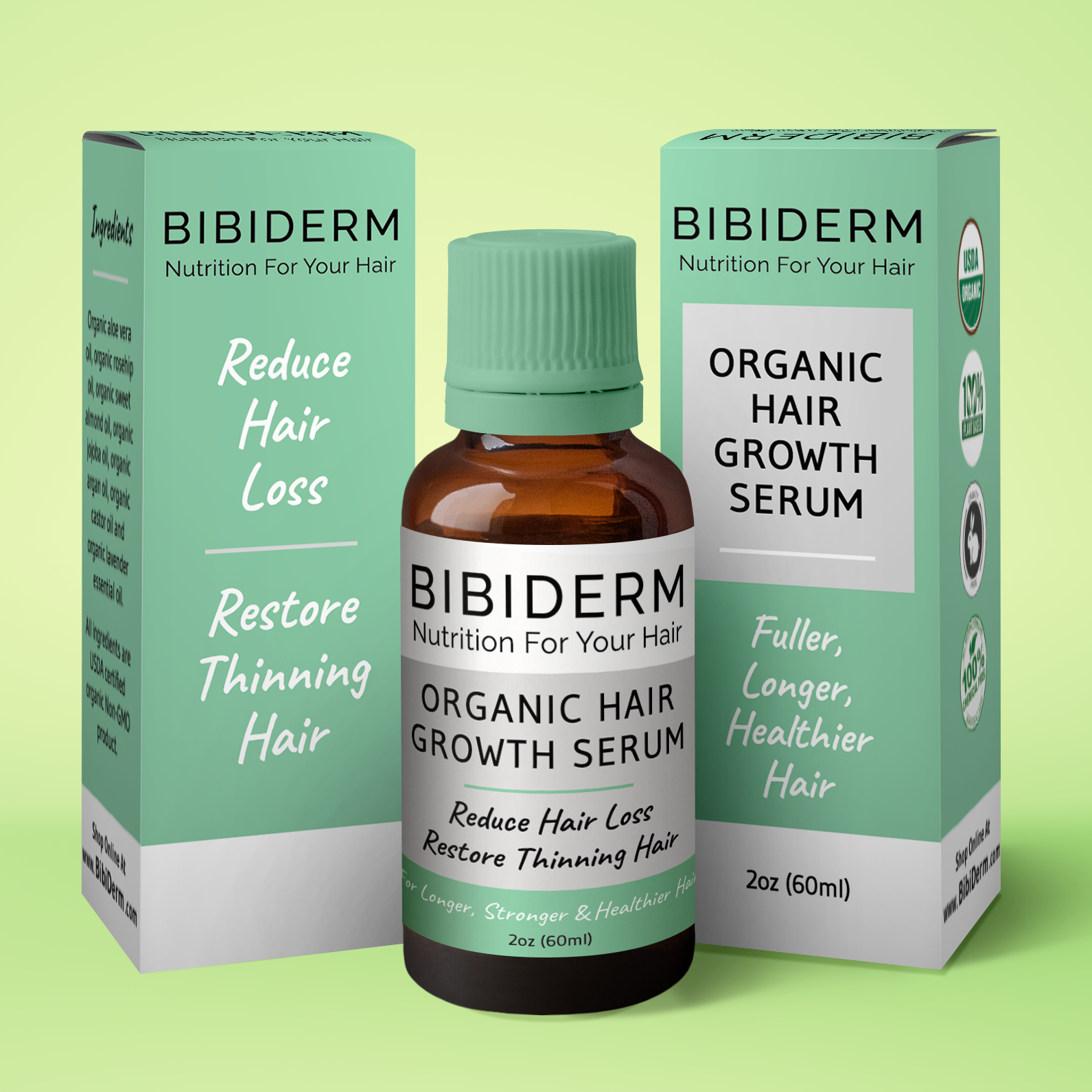
I used a modern color palette, font, and spacious layout for this box and label set.
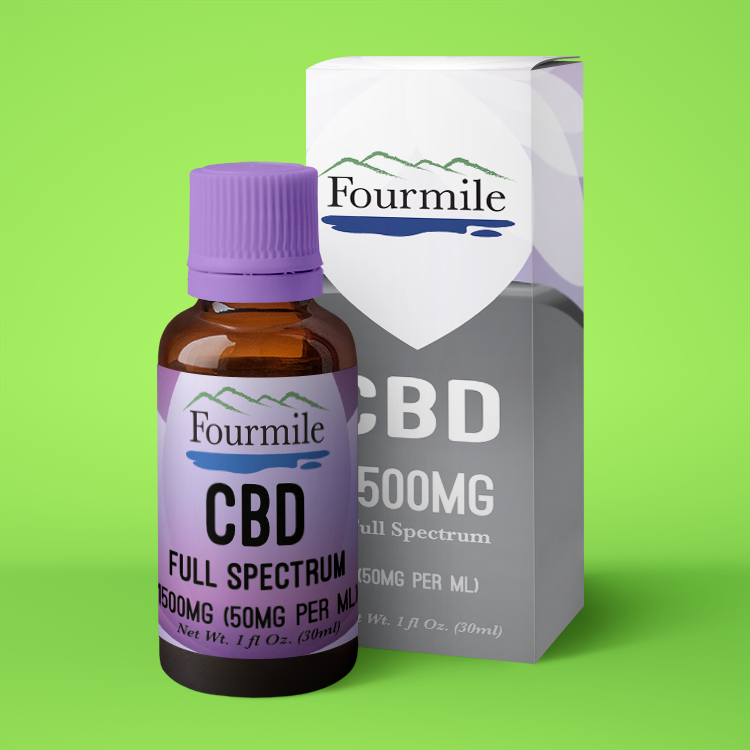
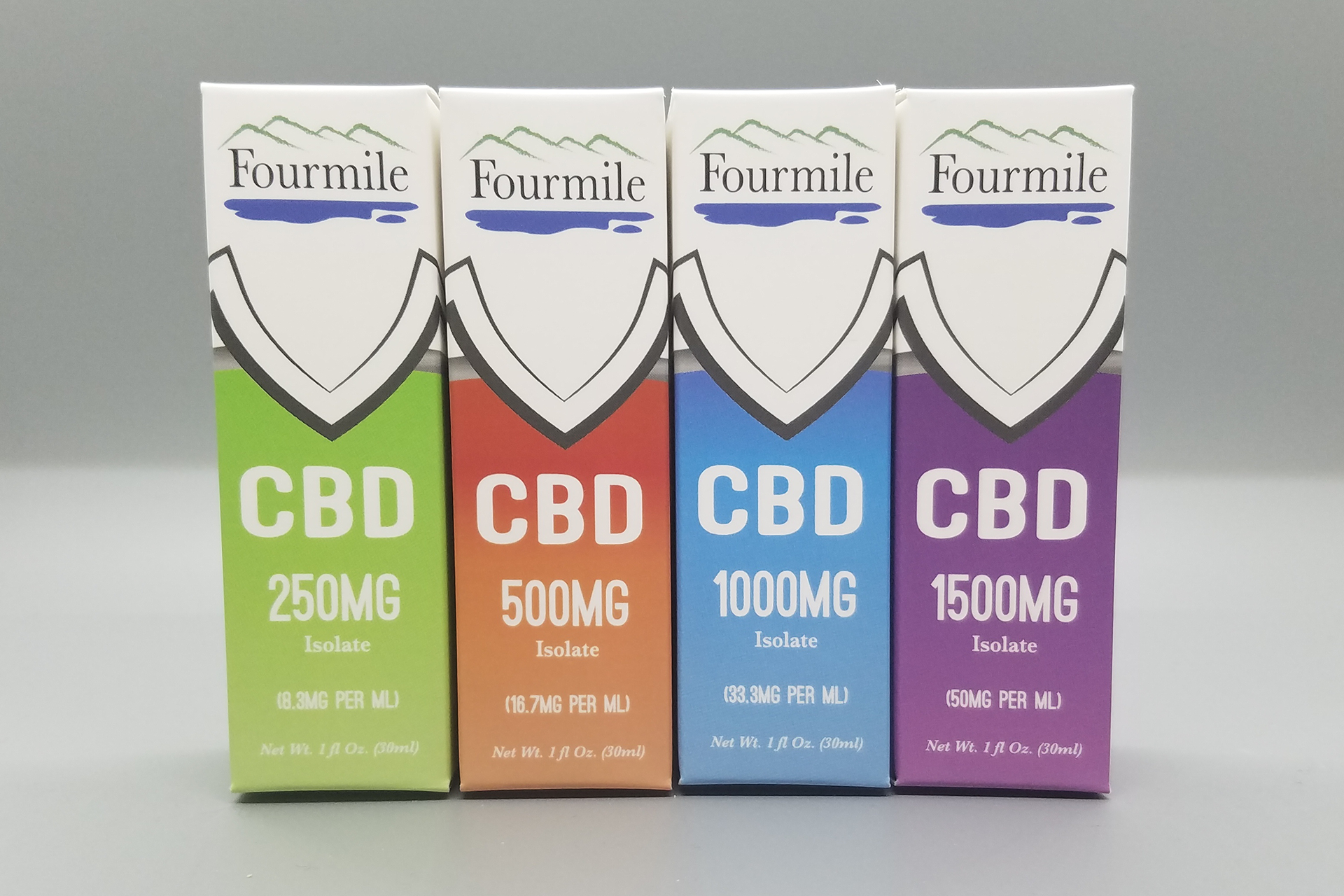
For the boxes and labels for this line of CBD products I used a wide color palette with slightly inverted elements to keep the lines cohesive but differentiate product types and variants.
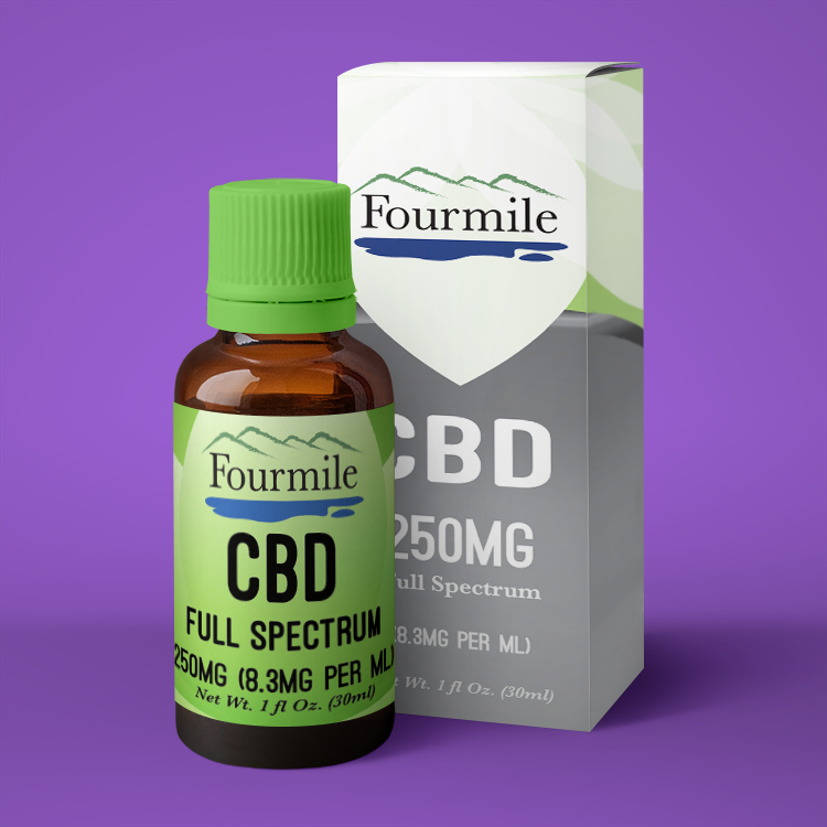
For the boxes and labels for this line of CBD products I used a wide color palette with slightly inverted elements to keep the lines cohesive but differentiate product types and variants.
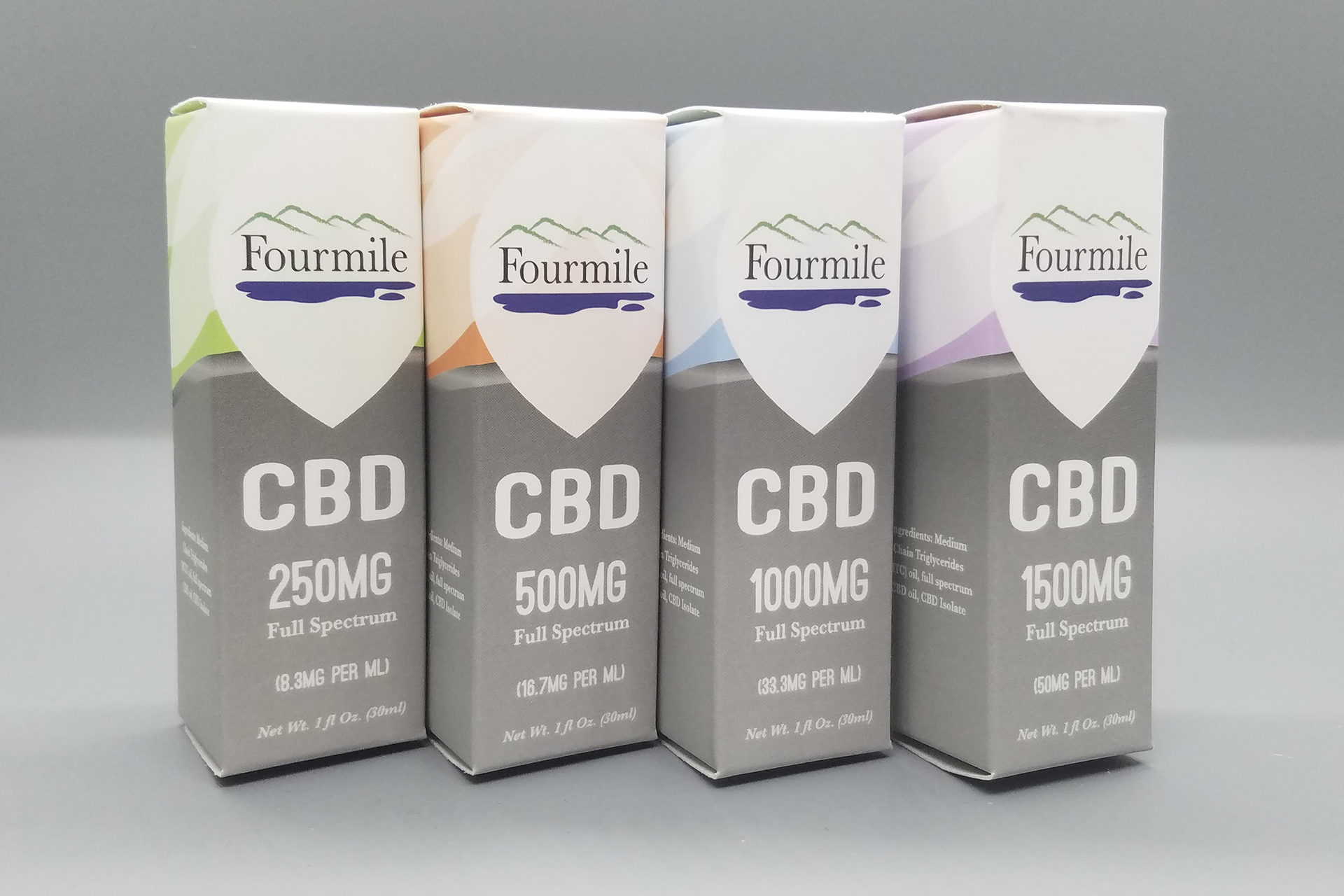
For the boxes and labels for this line of CBD products I used a wide color palette with slightly inverted elements to keep the lines cohesive but differentiate product types and variants.
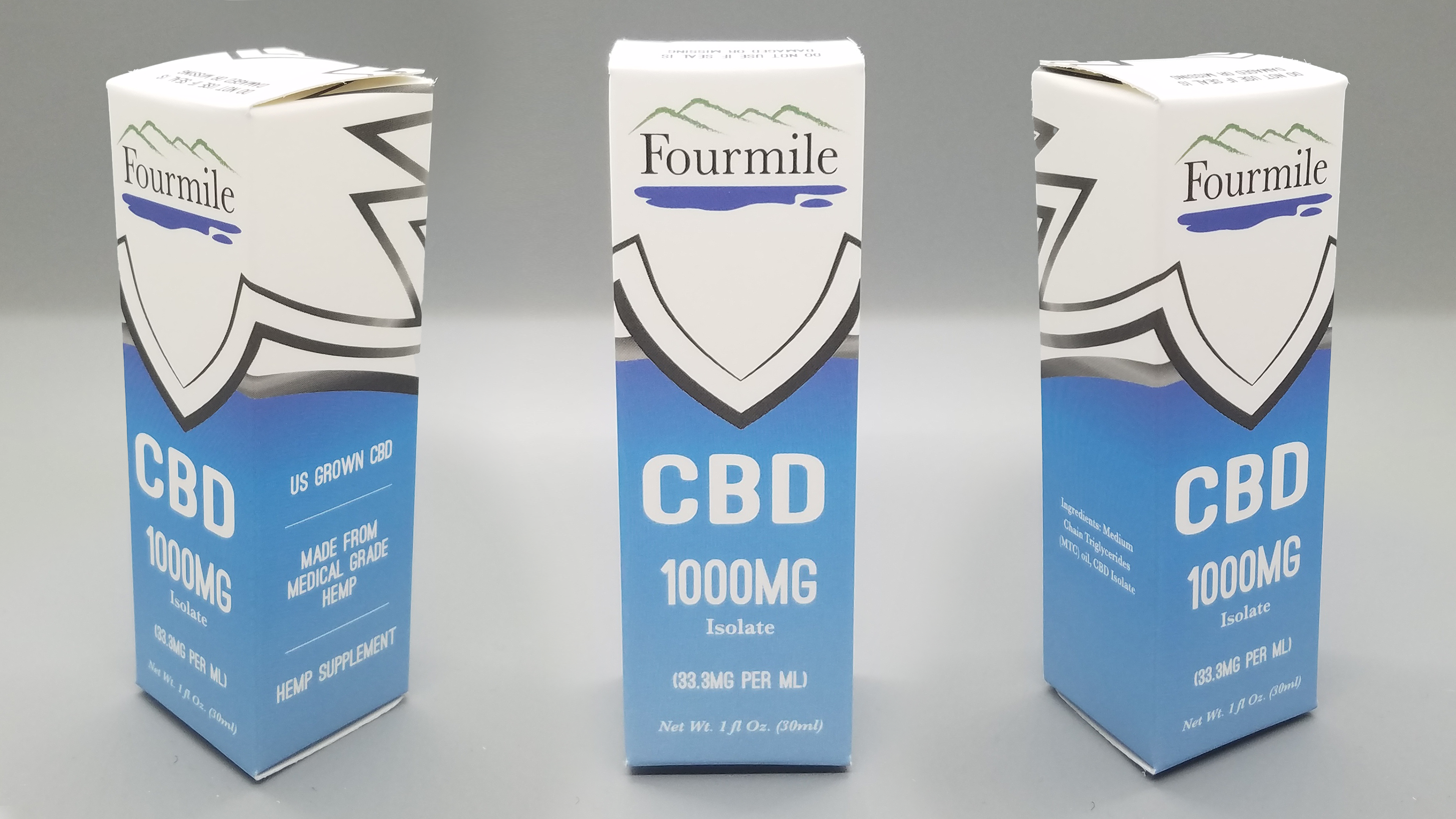
For the boxes and labels for this line of CBD products I used a wide color palette with slightly inverted elements to keep the lines cohesive but differentiate product types and variants.