Signage has been an interesting avenue of design for me to explore as there are different functionalities to consider than when designing these types of projects. Designing signage has taught me the importance of ensuring textual hierarchy, appropriate scale, that dimensions fit the installation area, the sign is legible from intended viewing distances and angles, the design avoids obstructions, the materials hold up to their environment, the image will print well when enlarged, and that print files that will work with intended production mediums and within installer specifications.
LARGE SCALE SIGNAGE
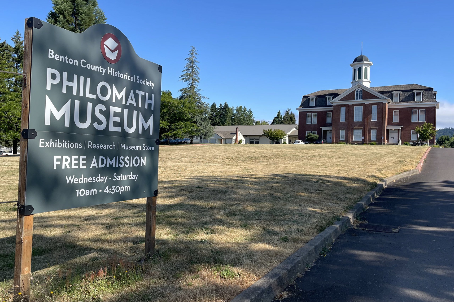
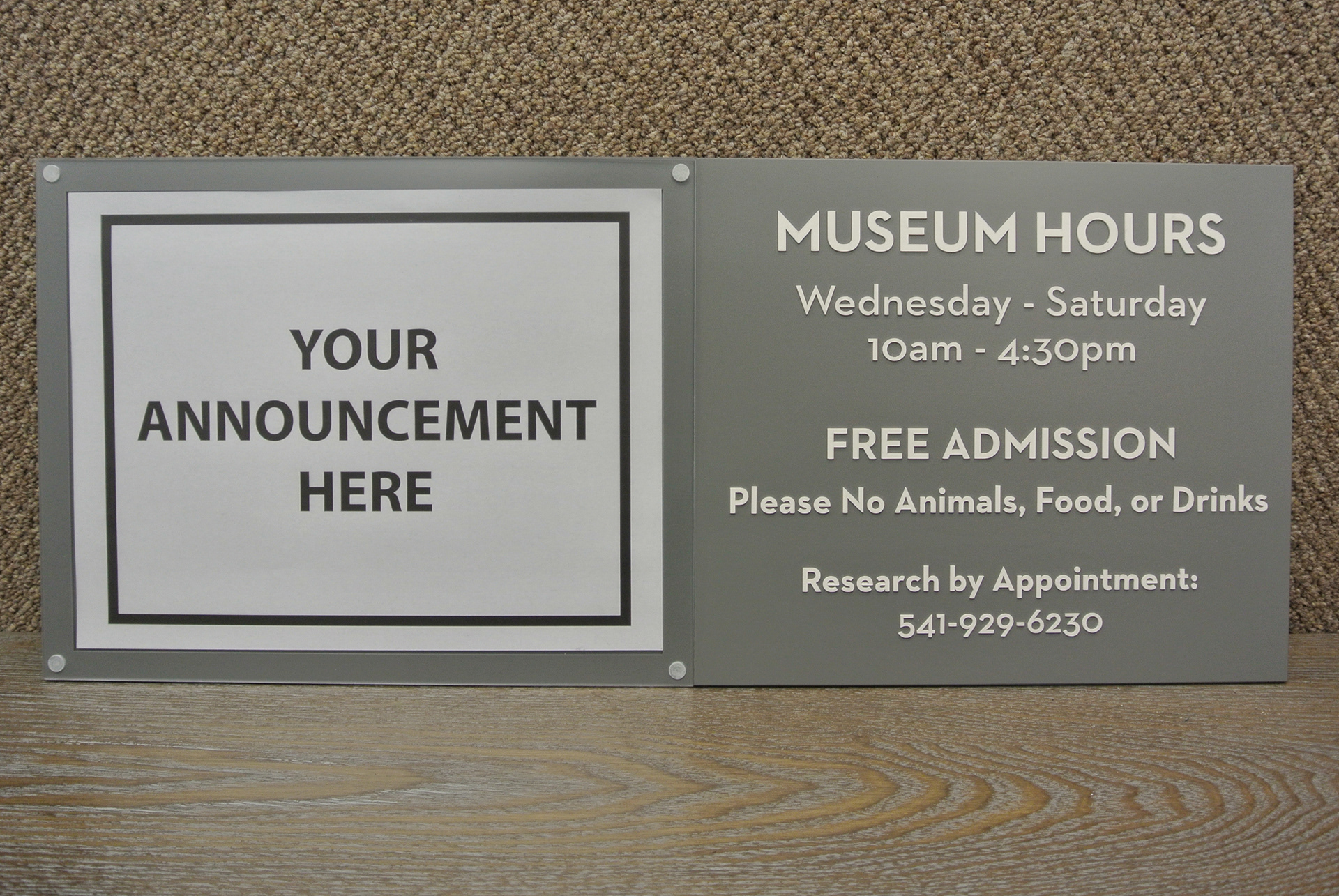
I designed the main road sign for the Philomath branch of the Benton County Museum. I took inspiration from existing town directional signage to inform the shape, signaling the building as a community space.
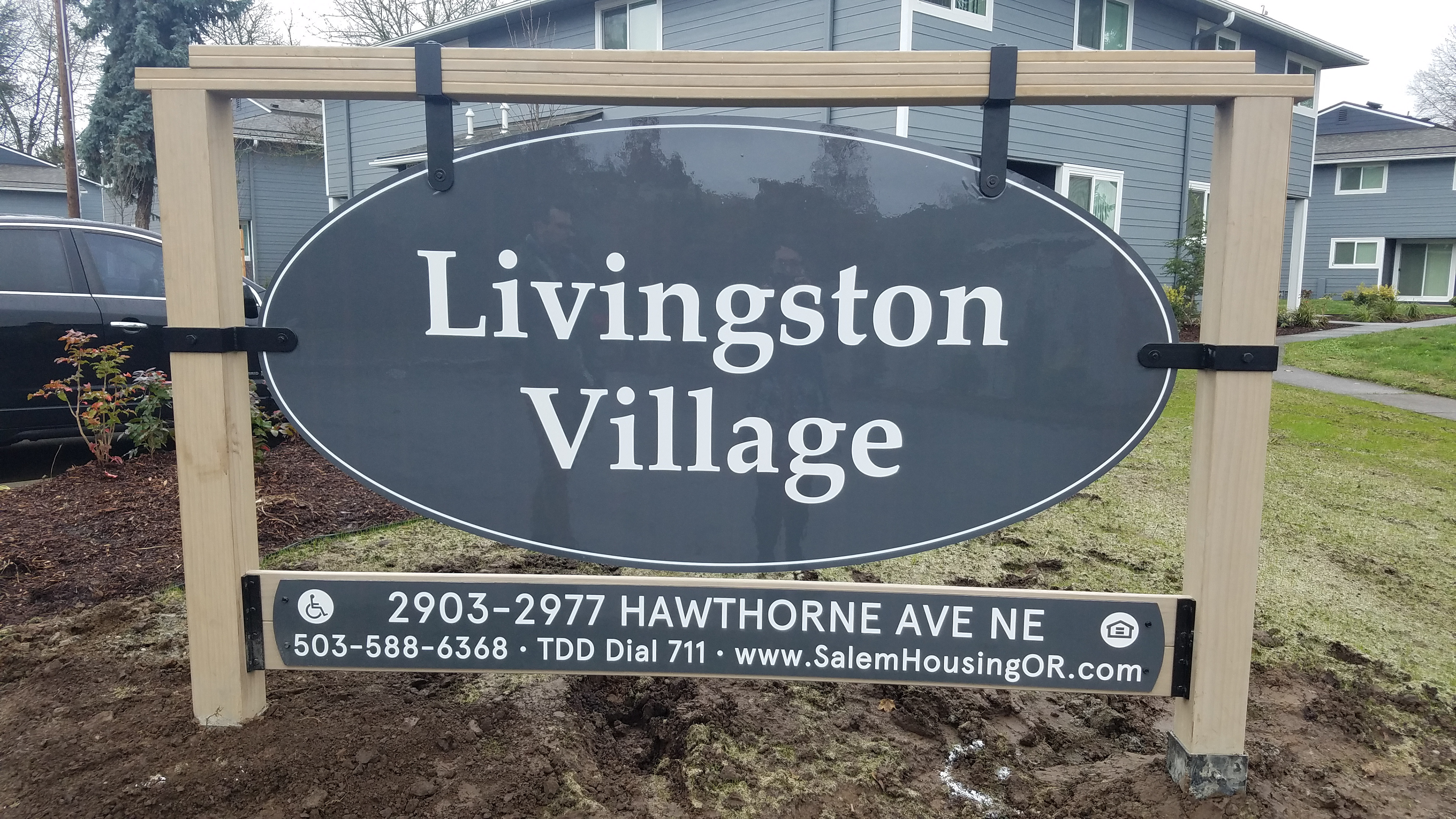
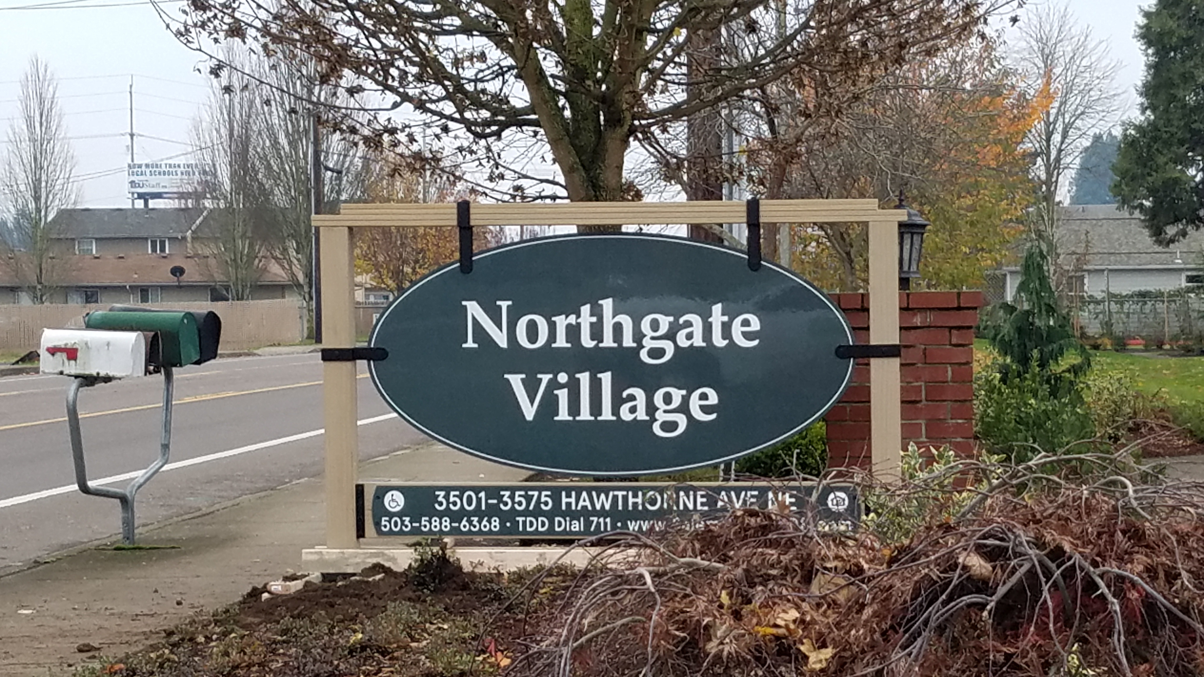
For Livingston and Northgate Village apartments, I engineered sign structures that tie the properties together under one visual brand identity. The challenges for this project included considering the durability of the materials, the overall rigidity and stability of the sign frame, and developing an identity that would look cohesive with the existing buildings and landscaping. The signs were made out of brackets that I designed for the project, a composite decking material, and aluminum signage panel.
For Livingston and Northgate Village apartments, I engineered sign structures that tie the properties together under one visual brand identity. The challenges for this project included considering the durability of the materials, the overall rigidity and stability of the sign frame, and developing an identity that would look cohesive with the existing buildings and landscaping. The signs were made out of brackets that I designed for the project, a composite decking material, and aluminum signage panel.
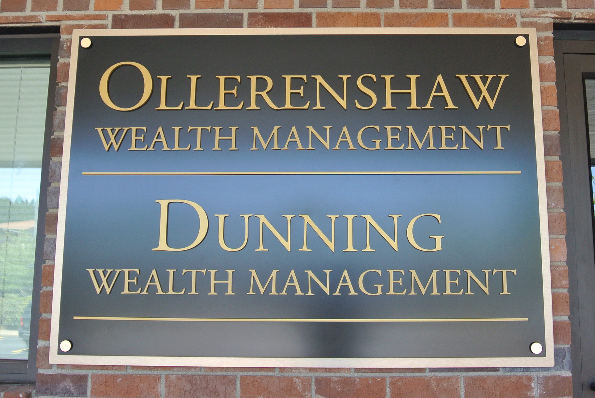
Using dimensional letters, layered acrylic panels, and sign standoffs, I created this building sign and accompanying window vinyl.
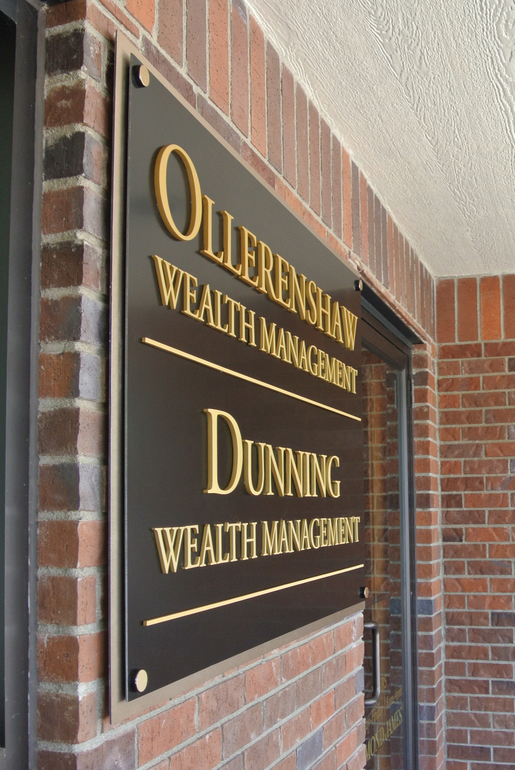
I chose to use dimensional letters and layer the panels with a spacer between them to add depth and visual interest, pushing the design in a more luxurious direction.
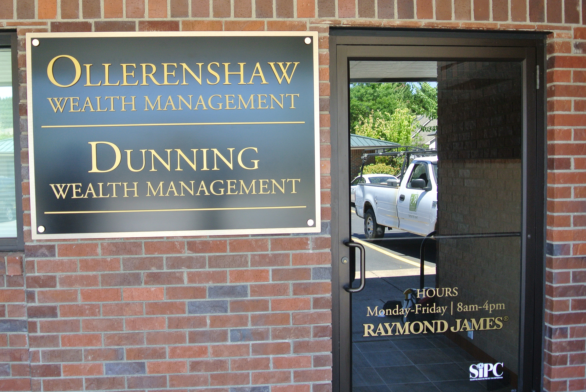
Using dimensional letters, layered acrylic panels, and sign standoffs, I created this building sign with accompanying window vinyl.
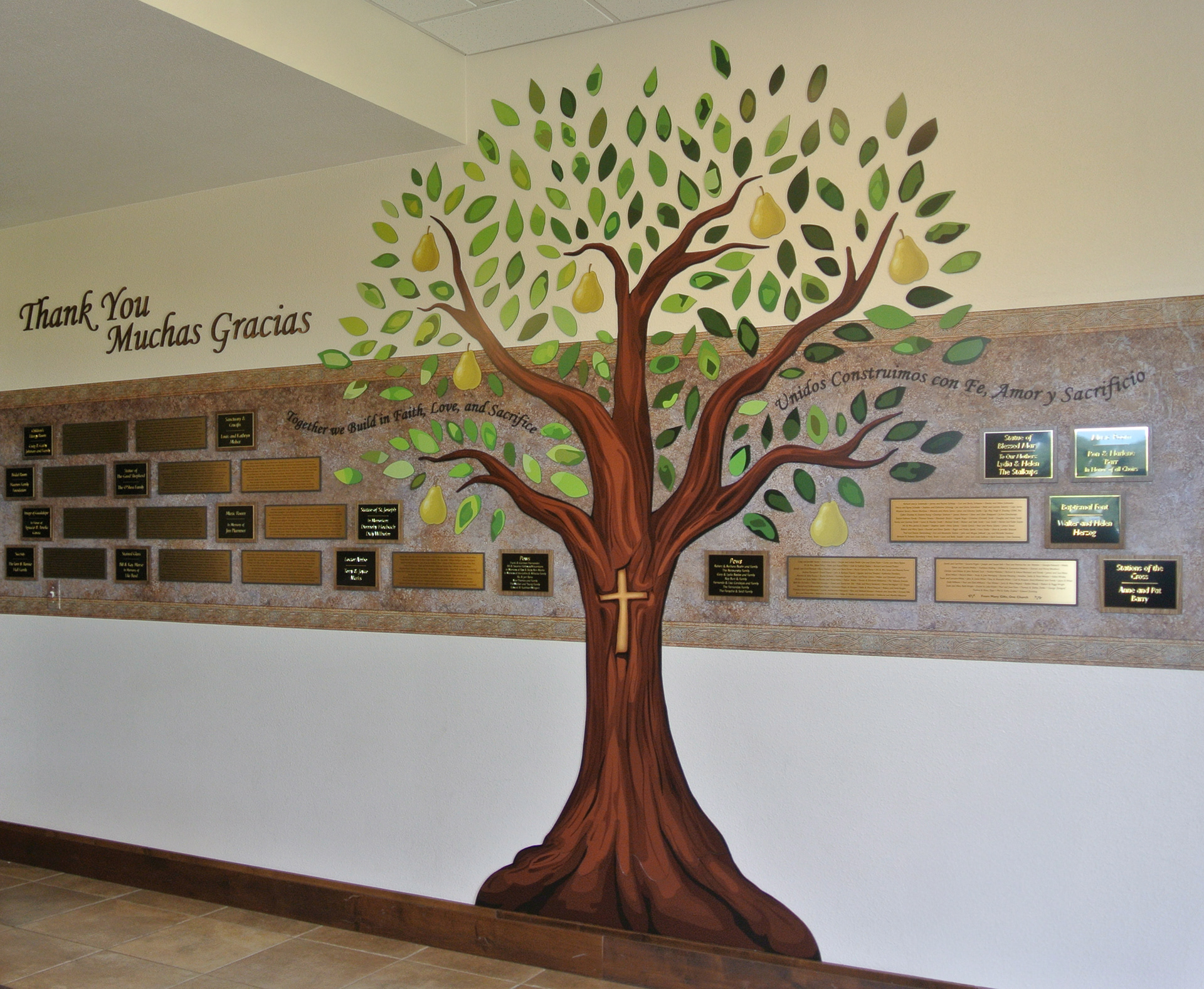
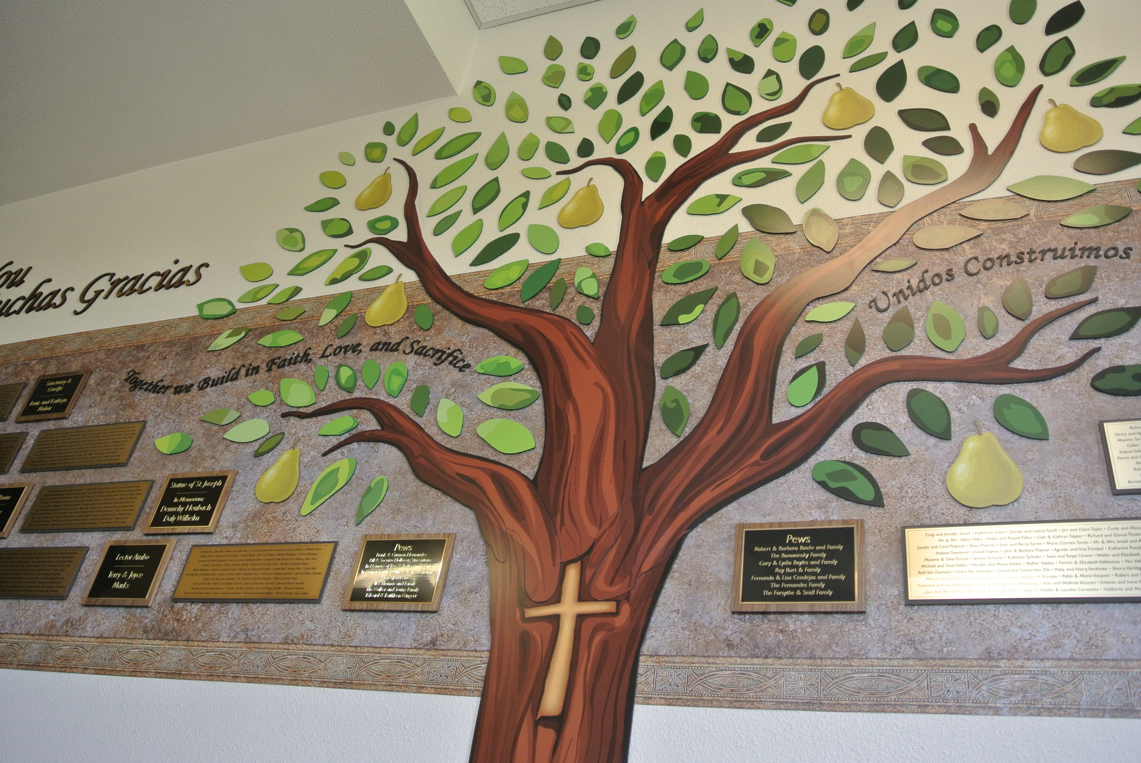
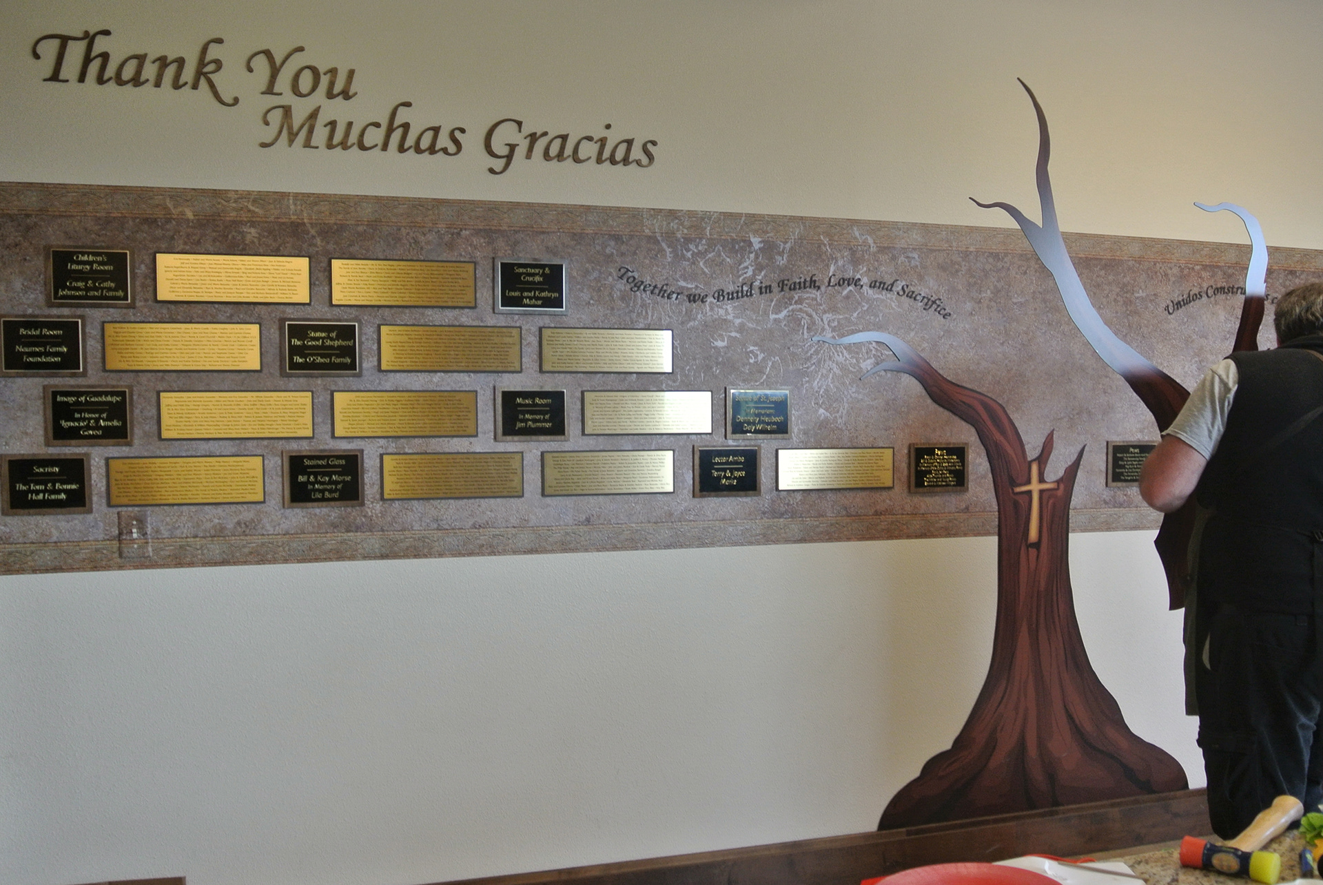
This donor wall mural was a project where I got to develop my digital drawing skills by illustrating the tree at the center of the display. I engineered the design so that it could be manufactured and installed in sections that would seamlessly merge together at the branch forks.
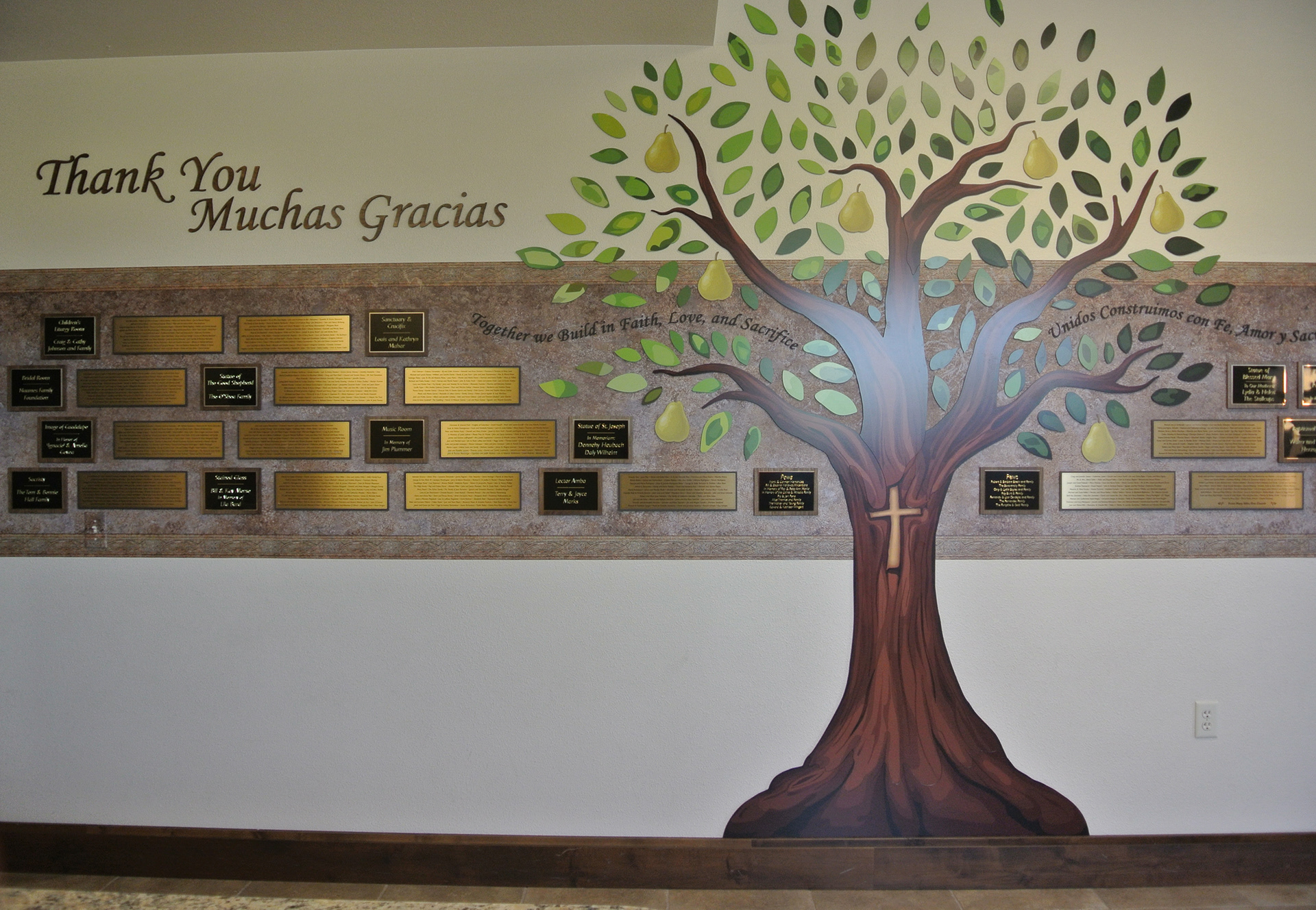
I contributed to the overall layout, as well as the design for each individual plaque.
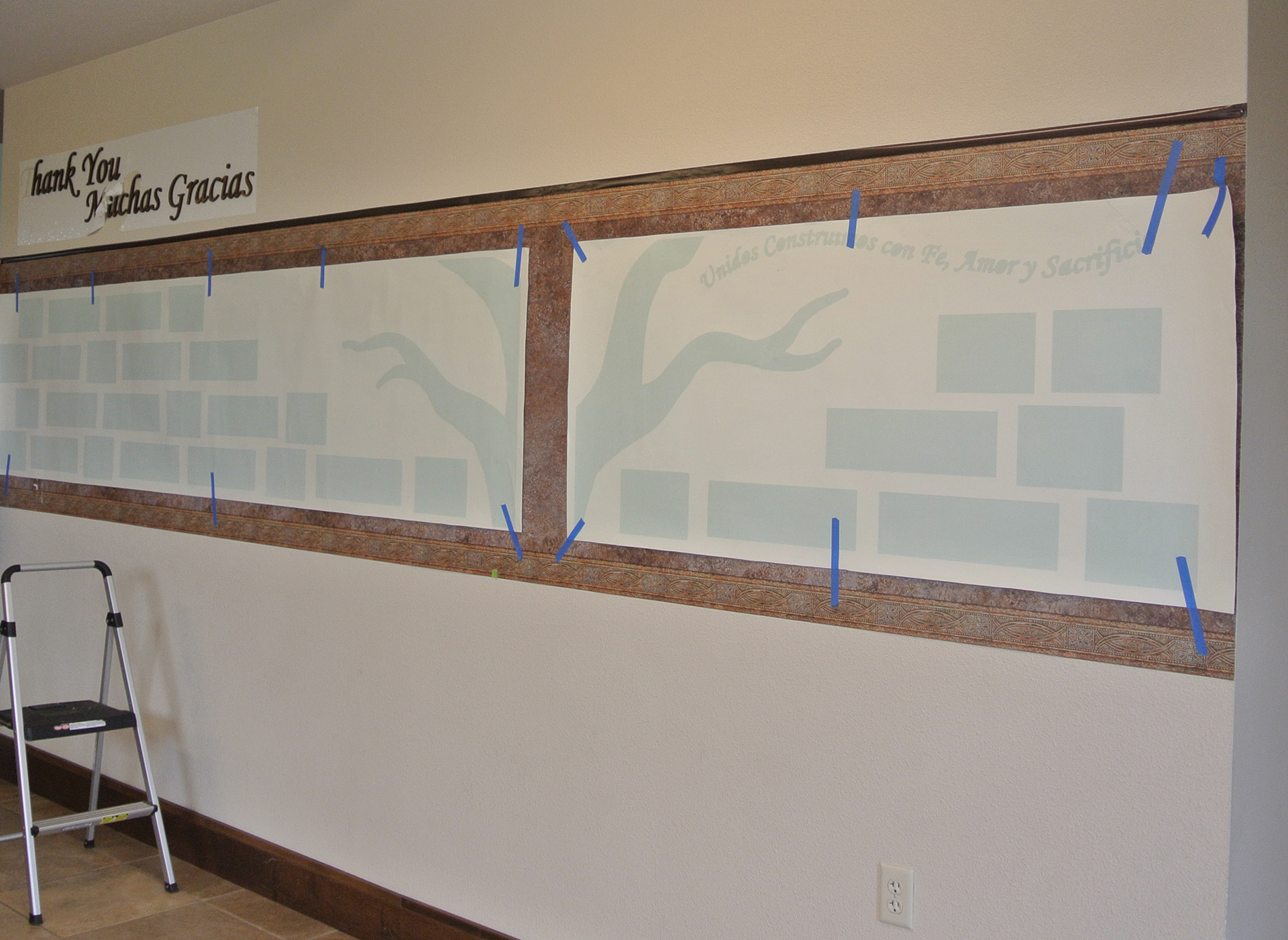
The client was very particular about the layout of the name plaques, as donors were recognized based on their contribution. Using an install guide for placement helped keep the project in order.
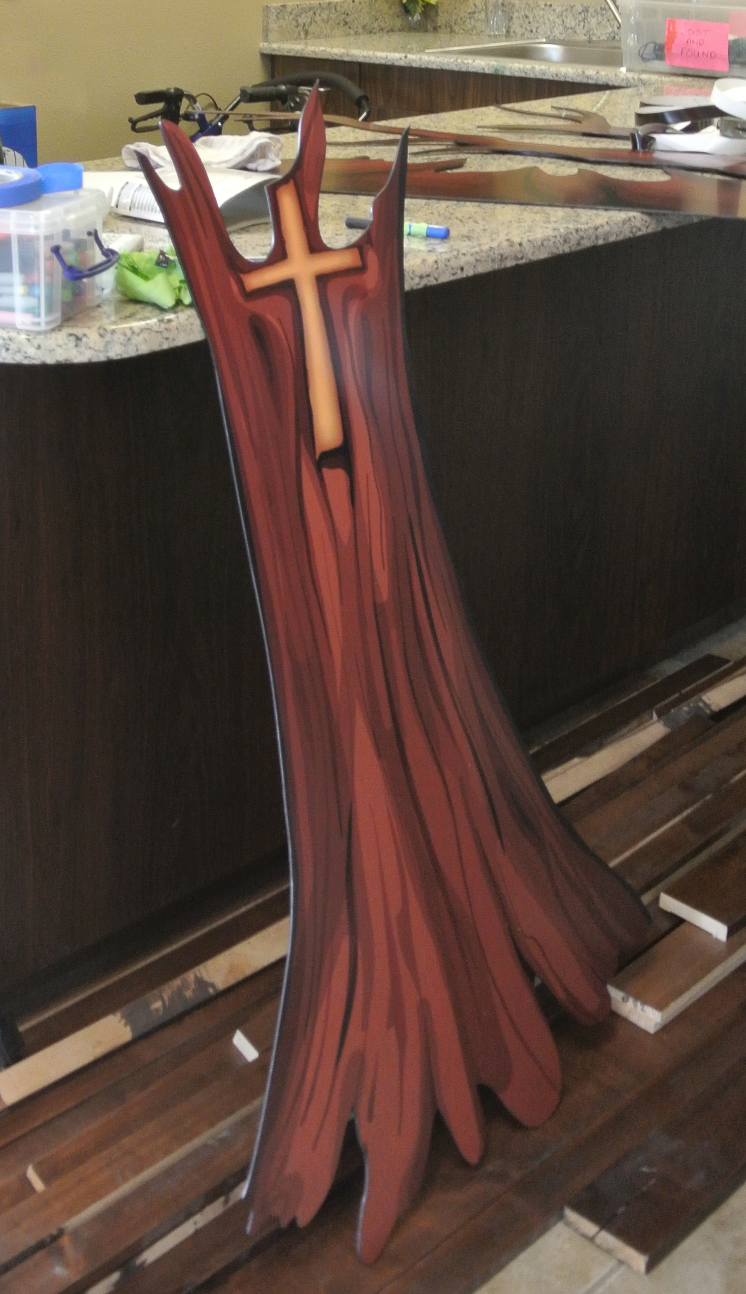
I worked closely with the client to add an image of a carved cross in a style and prominence that they were looking for.
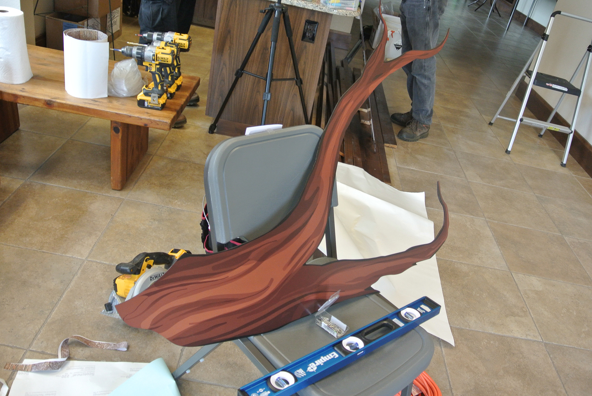
Due to material and production constraints, the tree, leaves, and plaques were all created as separate pieces, and installed individually.
The tree, leaves, and plaques were all created as separate pieces, and installed individually.
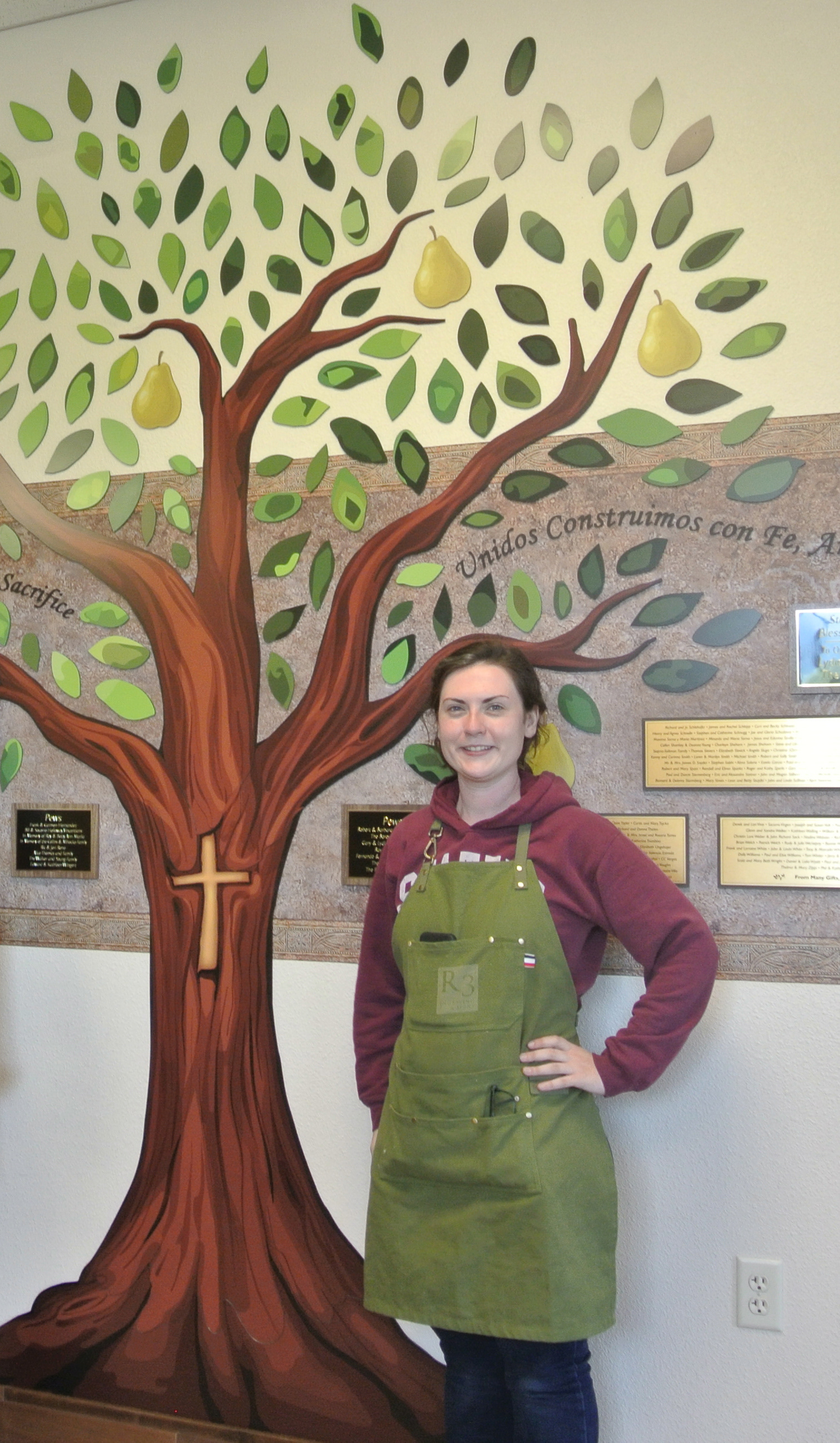
I was even a part of the installation crew that brought the whole project together on site!
WAYFINDING SIGNAGE
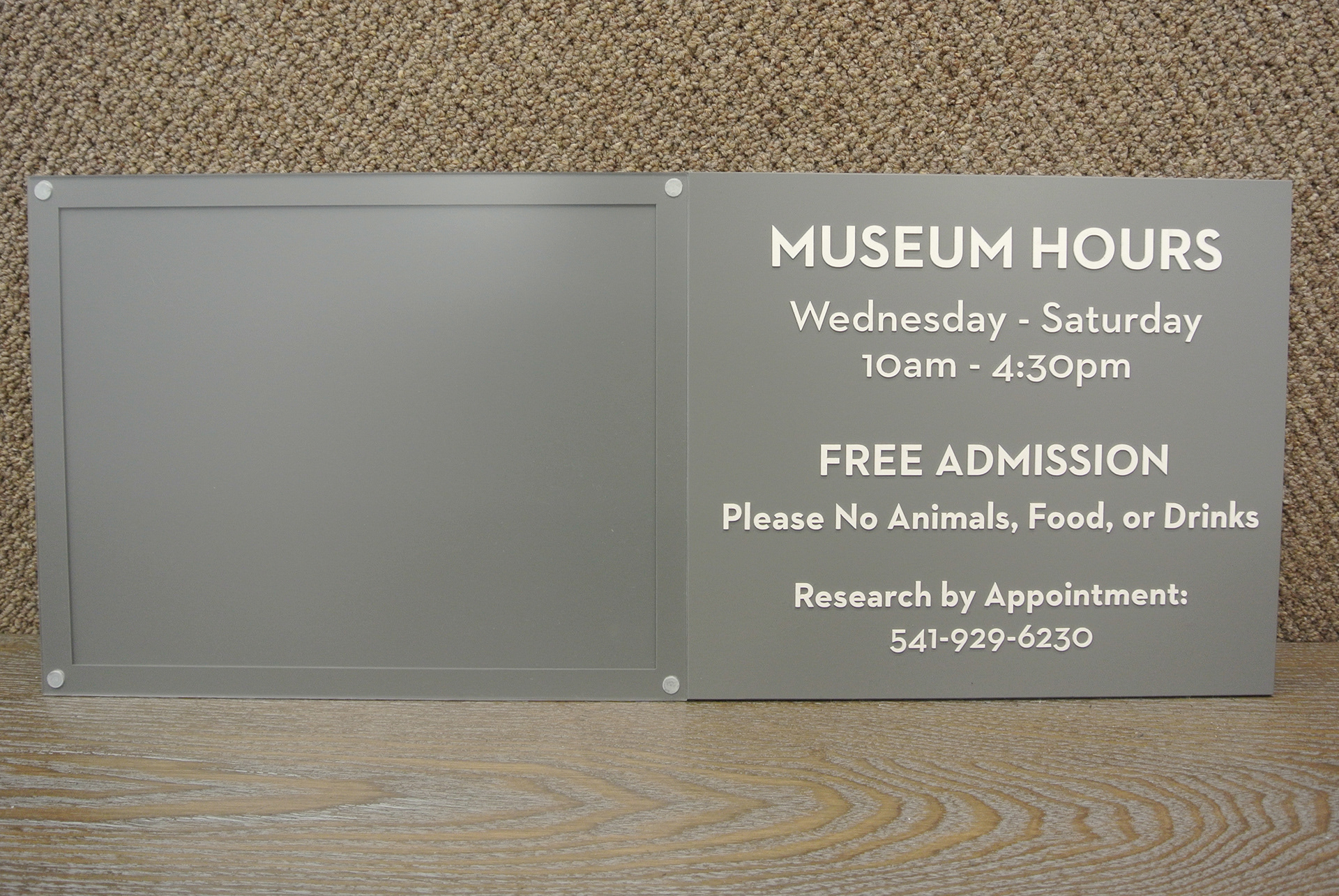
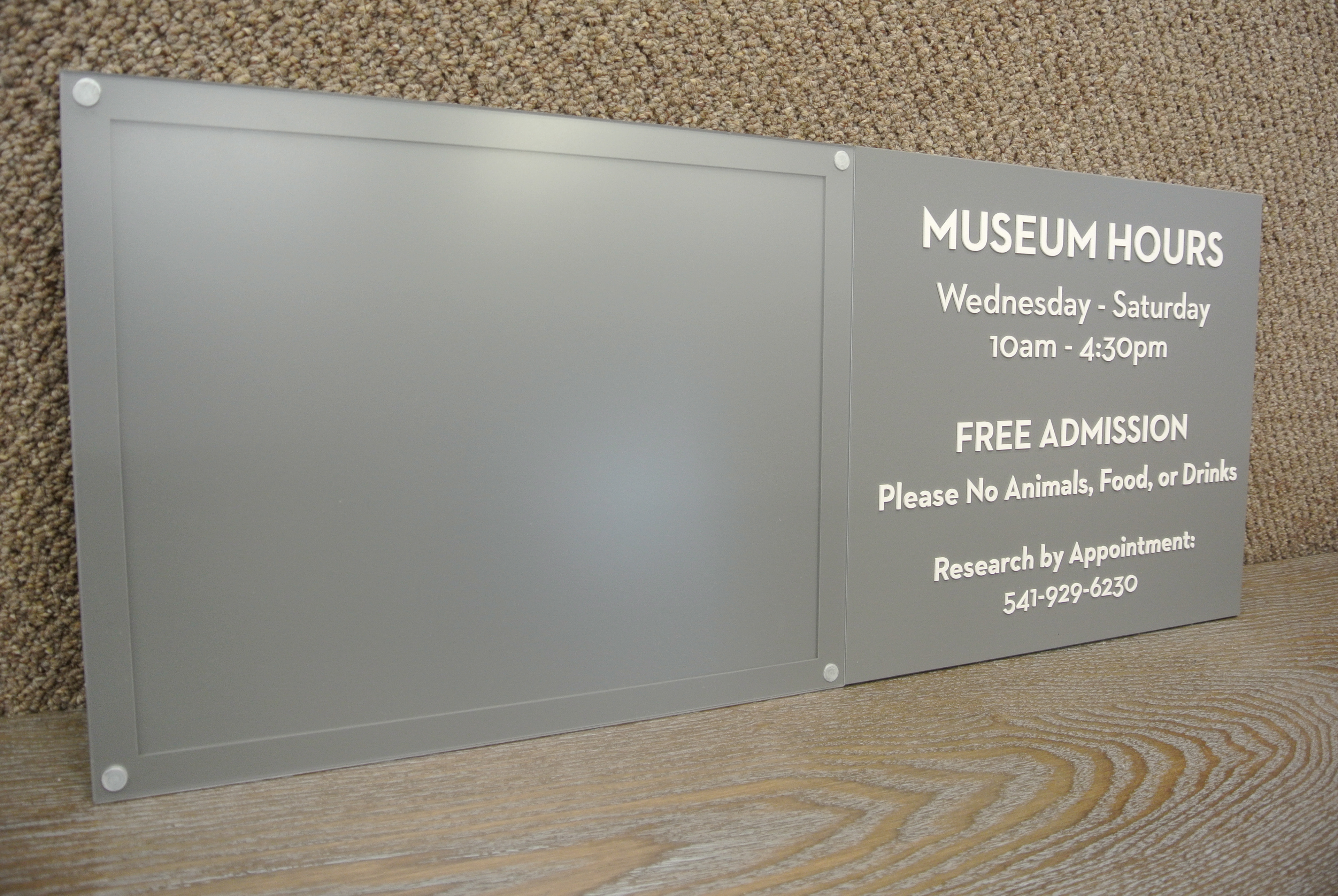
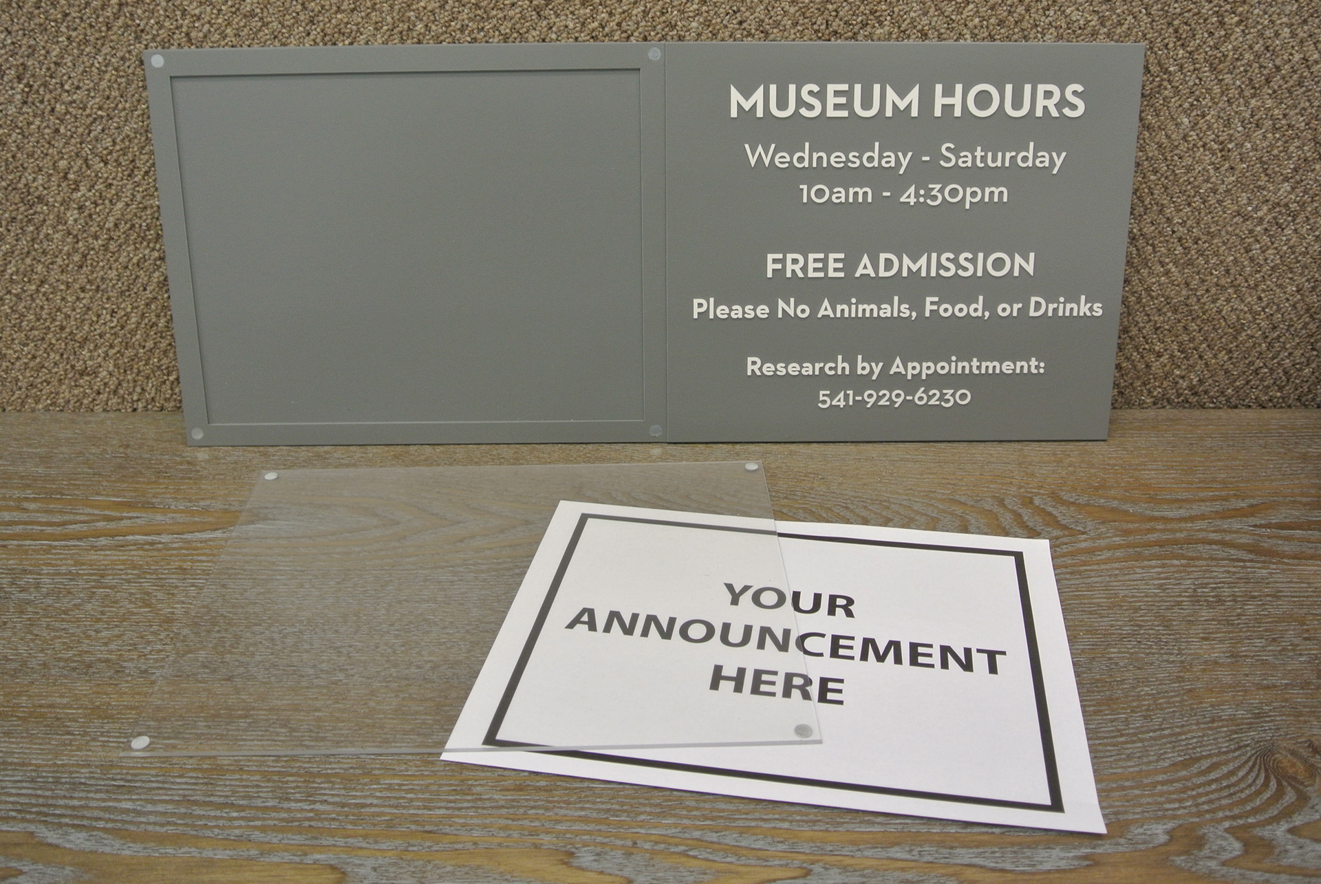
PRINTED SIGNAGE
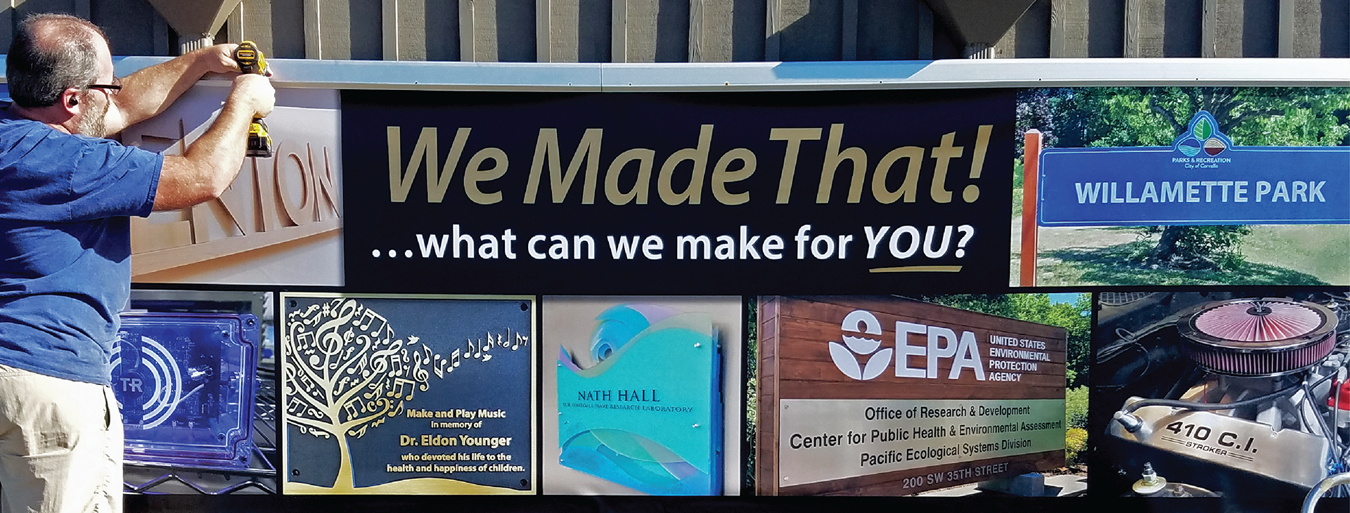
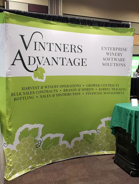
A banner billboard showcasing the design and production capabilities of the shop I worked for.